Big news today: The G8 summit declares that climate change mitigation policies should aim to limit global temperature increases to no more than 2°C above 1900 levels. This is the limit that Europe adopted as a guideline a long time ago, and which many climate scientists generally regard as an important threshold. I’ve asked many climate scientists why this particular threshold, and the answer is generally because above this level many different positive feedback effects start to kick in, which will amplify the warming and take us into really scary scenarios.
Not all scientists agree this threshold is a sensible target for politicians though. For example, David Victor argues that the 2°C goal is a political delusion. The gist of his argument is that targets such as 2°C are neither safe (because nobody really knows what is safe) nor achievable. He suggests that rather than looking at long term targets such as a temperature threshold, or a cumulative emissions target, politicians need to focus on a series of short-term, credible promises, which, when achieved, will encourage greater efforts.
The problem with this argument is that it misses the opportunity to consider the bigger picture, and understand the enormity of the problem. First, although 2°C doesn’t sound like much, in the context of the history of the planet, it’s huge. James Hansen and colleagues put this into context best, by comparing current warming with the geological record. They point out that with the warming we have already experienced over the last century, the earth is now about as warm as the Holocene Maximum (about 5,000-9,000 years ago), and within 1°C of the maximum temperature of the last million years. If you look at Hansen’s figures (e.g. fig 5, shown below) you’ll see the difference in temperature between the ice ages and the interglacials is around 3°C. For example, the last ice age, which ended about 12,000 years ago shows up as the last big rise on this graph (a rise from 26°C to 29°C):

The wikipedia entry on the Geologic temperature record has a nice graph pasting together a number of geological temperature records to get the longer term view (but it’s not peer-reviewed, so it’s not clear how valid the concatenation is). Anyway, Hansen concludes that 1°C above the 2000 temperature is already in the region of dangerous climate change. If a drop of 3°C is enough to cause an ice age, a rise of 2°C is pretty significant for the planet.
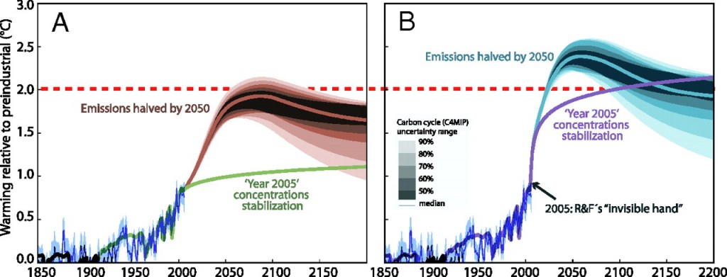
Even more worrying is that some scientists think we’re already committed to more than 2°C rise, based on greenhouse gases already emitted in the past, irrespective of what we do from today onwards. For example, Ramanathan and Feng’s paper in PNAS – Formidable challenges ahead, sets up a scenario in which greenhouse gas concentrations are fixed at 2005 levels, (i.e. no new emissions after 2005) and discover that the climate eventually stabilizes at +2.4°C (with an 95% confidence interval of 1.4°C to 4.3°C). In other words, it is more than likely that we’ve already committed to more than 2°C even if we stopped burning all fossil fuels today. [Note: when you read these papers, take care to distinguish between emissions and concentrations]. Now of course, R&F made some assumptions that can be challenged. For example, they assumed the cooling effect of other forms of pollution (e.g atmospheric aerosols) is ignored. There’s a very readable editorial comment on this paper by Hans Schellnhuber in which he argues that, while it’s useful to be reminded how much our greenhouse gas warming is being masked by other kinds of air pollution, it is still possible to keep below 2°C if we halve emissions by 2050. Here’s his graph (A), compared with R&F’s (B):

The lower line on each graph is for constant concentrations from 2005 (i.e. no new emissions). The upper curves are projections for reducing emissions by 50% by 2050. The difference is that in (A), other forcings from atmospheric pollution are included (dirty air and smog, as per usual…).
But that’s not the end of the story. Both of the above graphs are essentially just “back of the envelope” calculations, based on data from previous studies such as those included in the IPCC 2007 assessment. More recent research has investigated these questions directly, using the latest models. The latest analysis is much more like R&F’s graph (B) than Shellenhuber’s graph (A). RealClimate has a nice summary of two such papers in Nature, in April 2009. Basically, if developed countries cut their emissions by 80% by 2050, we still only get a 50% chance of sticking below the 2°C threshold. Another way of putting this is that a rise of 2°C is about the best we can hope for, even with the most aggressive climate policies imaginable. Parry et al argue we should be prepared for rises of around 4°C. And I’ve already blogged what that might be like.
So, nice to hear the the G8 leaders embrace the science. But what we really need is for them to talk about how bad it really is. And we need action. And fast.
(Update: Gareth Renowden has a lengthier post with more detail on this (framed by discussion of what NZ’s targets should be)


