Next Wednesday, we’re oganising demos of our students’ summer projects, prior to the Science 2.0 conference. The demos will be in BA1200 (in the Bahen Centre), Wed July 29, 10am-12pm. All welcome!

Here are the demos to be included (running order hasn’t been determined yet – we’ll probably pull names out of hat…):

  • Basie (demo’d by Bill Konrad, Eran Henig and Florian Shkurti)
    Basie is a light weight, web-based software project forge with an emphasis on inter-component communication.  It integrates revision control, issue tracking, mailing lists, wikis, status dashboards, and other tools that developers need to work effectively in teams.  Our mission is to make Basie simple enough for undergraduate students to master in ten minutes, but powerful enough to support large, distributed teams.
  • BreadCrumbs (demo’d by Brent Mombourquette).
    When researching, the context in which a relevant piece of information is found is often overlooked. However, the journey is as important as the destination. BreadCrumbs is a Firefox extension designed to capture this journey, and therefor the context, by maintaining a well structured and dynamic graph of an Internet browsing session. It keeps track of both the chronological order in which websites are visited and the link-by-link path. In addition, through providing simple tools to leave notes to yourself, an accurate record of your thought process and reasoning for browsing the documents that you did can be preserved with limited overhead. The resulting session can then be saved and revisited at a later date, with little to no time spent trying to recall the relevance or semantic relations of documents in an unordered bookmark folder, for example. It can also be used to provide information to a colleague, by not just pointing them to a series of web pages, but by providing them a trail to follow and embedded personal notes. BreadCrumbs maintains the context so that you can focus on the content.
  • Feature Diagram Tool (demo’d by Ebenezer Hailemariam)
    We present a software tool to assist software developers work with legacy code. The tool reverse engineers “dependency diagrams” from Java code through which developers can perform refactoring actions. The tool is a plug-in for the Eclipse integrated development environment.
  • MarkUs (demo’d by Severin GehwolfNelle Varoquaux and Mike Conley)
    MarkUs is a Web application that recreates the ease and flexibility of grading assignments with pen on paper. Graders fill in a marking scheme and directly annotate student’s work.  MarkUs also provides support for other aspects of assignment delivery and management.  For example, it allows students or instructors to form groups for assignment collaboration, and allows students to upload their work for grading. Instructors can also create and manage group or solo assignments, and assign graders to mark and annotate the students’ work quickly and easily.
  • MyeLink: drawing connections between OpenScience lab notes (demo’d by Maria Yancheva)
    A MediaWiki extension which facilitates connections between related wiki pages, notes, and authors. Suitable for OpenScience research communities who maintain a wiki collection of experiment pages online. Provides search functionality on the basis of both structure and content of pages, as well as a user interface allowing the customization of options and displaying an embedded preview of results.
  • TracSNAP – Trac Social Network Analysis Plugin (demo’d by Ainsley Lawson and Sarah Strong)
    TracSNAP is a suite of simple tools to help contributors make use of information about the social aspect of their Trac coding project. It tries to help you to: Find out which other developers you should be talking to, by giving contact suggestions based on commonality of file edits; Recognize files that might be related to your current work, by showing you which files are often committed at the same time as your files; Get a feel for who works on similar pieces of functionality based on discussion in bug and feature tickets, and by edits in common; Visualize your project’s effective social network with graphs of who talks to who; Visualize coupling between files based on how often your colleagues edit them together.
  • VizExpress (demo’d by Samar Sabie)
    Graphs are effective visualizations because they present data quickly and easily. vizExpress is a Mediawiki extension that inserts user-customized tables and graphs in wiki pages without having to deal with complicated wiki syntax. When editing a wiki page, the extension adds a special toolbar icon for opening the vizExpress wizard. You can provide data to the wizard by browsing to a local Excel or CSV file, or by typing (or copying/pasting) data. You can choose from eight graph types and eight graph-coloring schemes, and apply further formatting such as titles, dimensions, limits, and legend position. Once a graph is inserted in a page, you can easily edit it by restarting the wizard or modifying a simple vizExpress tag.

[Update: the session was a great success, and some of the audience have blogged about it already: e.g. Cameron Neylon]

In our climate brainstorming session last week, we invited two postdocs (Chris and Lawrence) from the atmospheric physics group to come and talk to us about their experiences of using climate models. Most of the discussion focussed on which models they use and why, and what problems they experience. They’ve been using the GFDL models, specifically AM2 and AM3 (atmosphere only models) for most of their research, largely because of legacy: they’re working with Paul Kushner, who is from GFDL,  and the group now has many years experience working with these models. However, they’re now faced with having to switch to NCAR’s Community Climate System Model (CCSM). Why? Because the university has acquired a new IBM supercomputer, and the GFDL models won’t run on it (without a large effort to port them). The resulting dilemma reveals a lot about the current state of climate model engineering:

  • If they stick with the GFDL models, they can’t make use of the new supercomputer, hence miss out on a great opportunity to accelerate their research (they could do many more model runs).
  • If they switch to CCSM, they lose a large investment in understanding and working with the GFDL models. This includes both their knowledge of the model (some of their research involves making changes to the code to explore how perturbations affect the runs), and the investment in tools and scripts for dealing with model outputs, diagnostics, etc.

Of course, the obvious solution would be to port the GFDL models to the new IBM hardware. But this turns out to be hard because the models were never designed for portability. Right now, the GFDL models won’t even compile on the IBM compiler, because of differences in how picky different compilers are over syntax and style checking – climate models tend to have many coding idiosyncrasies that are never fixed because the usual compiler never complains about them: e.g. see Jon’s analysis of static checking NASA’s modelE. And even if they fix all these and get the compiler to accept the code, they’re still faced with extensive testing to make sure the models’ runtime behaviour is correct on the new hardware.

There’s also a big difference in support available. GFDL doesn’t have the resources to support external users (particularly ambitious attempts to port the code). In contrast, NCAR has extensive support for the CCSM, because they have made community building an explicit goal. Hence, CCSM is much more like an open source project. Which sounds great, but it also comes at a cost. NCAR have to devote significant resources to supporting the community. And making the model open and flexible (for use by a broader community) hampers their ability to get the latest science into the model quickly. Which leads me to hypothesize that it is the diversity of your user-base that most restricts the ongoing rate of evolution of a software system. For a climate modeling centers like GFDL, if you don’t have to worry about developing for multiple platforms and diverse users, you can get new ideas into the model much quicker.

Which brings me to a similar discussion over the choice of weather prediction models in the UK. Bryan recently posted an article about the choice between WRF (NCAR’s mesoscale weather model) versus the UM (the UK Met Office’s model). Alan posted a lengthy response which echoes much of what I said above (but with much more detail): basically the WRF is well supported and flexible for a diverse community. The UM has many advantages (particularly speed), but is basically unsupported outside the Met Office. He concludes that someone should re-write the UM to run on other hardware (specifically massively parallel machines), and presumably set up the kind of community support that NCAR has. But funding for this seems unlikely.

Spurred on by Michael Tobis’s thoughts about building a readable/understandable climate model in Python, I dug up an old bookmark to a course offered in UMinn’s geology department on Designing your own “Earth System” Model. Really neat idea for a course. Now, with a bit of tweaking, I could set up a similar course here, but with a twist – we recruit a mix of CS and Physics students onto the course, and put them together in cross-disciplinary teams, each team building an earth system model of some kind (tapping into the domain knowledge of the physicists), using current CS and software engineering tools and techniques. And to keep Michael happy, they code it all in Python. Marks awarded based on understandability of the code.

In the longer term, we keep the models produced from each instance of the course, and get the next cohort of students to develop them further – the aim is to build them up to be full scale earth system models.

Update: Michael has posted some more reflections on this.

Big news today: The G8 summit declares that climate change mitigation policies should aim to limit global temperature increases to no more than 2°C above 1900 levels. This is the limit that Europe adopted as a guideline a long time ago, and which many climate scientists generally regard as an important threshold. I’ve asked many climate scientists why this particular threshold, and the answer is generally because above this level many different positive feedback effects start to kick in, which will amplify the warming and take us into really scary scenarios.

Not all scientists agree this threshold is a sensible target for politicians though. For example, David Victor argues that the 2°C goal is a political delusion. The gist of his argument is that targets such as 2°C are neither safe (because nobody really knows what is safe) nor achievable. He suggests that rather than looking at long term targets such as a temperature threshold, or a cumulative emissions target, politicians need to focus on a series of short-term, credible promises, which, when achieved, will encourage greater efforts.

The problem with this argument is that it misses the opportunity to consider the bigger picture, and understand the enormity of the problem. First, although 2°C doesn’t sound like much, in the context of the history of the planet, it’s huge. James Hansen and colleagues put this into context best, by comparing current warming with the geological record. They point out that with the warming we have already experienced over the last century, the earth is now about as warm as the Holocene Maximum (about 5,000-9,000 years ago), and within 1°C of the maximum temperature of the last million years. If you look at Hansen’s figures (e.g. fig 5, shown below) you’ll see the difference in temperature between the ice ages and the interglacials is around 3°C. For example, the last ice age, which ended about 12,000 years ago shows up as the last big rise on this graph (a rise from 26°C to 29°C):

F5.large

The wikipedia entry on the Geologic temperature record has a nice graph pasting together a number of geological temperature records to get the longer term view (but it’s not peer-reviewed, so it’s not clear how valid the concatenation is). Anyway, Hansen concludes that 1°C above the 2000 temperature is already in the region of dangerous climate change. If a drop of 3°C is enough to cause an ice age, a rise of 2°C is pretty significant for the planet.

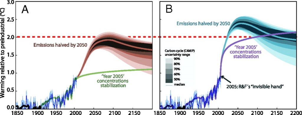
Even more worrying is that some scientists think we’re already committed to more than 2°C rise, based on greenhouse gases already emitted in the past, irrespective of what we do from today onwards. For example, Ramanathan and Feng’s paper in PNAS – Formidable challenges ahead, sets up a scenario in which greenhouse gas concentrations are fixed at 2005 levels, (i.e. no new emissions after 2005) and discover that the climate eventually stabilizes at +2.4°C (with an 95% confidence interval of 1.4°C to 4.3°C). In other words, it is more than likely that we’ve already committed to more than 2°C even if we stopped burning all fossil fuels today. [Note: when you read these papers, take care to distinguish between emissions and concentrations]. Now of course, R&F made some assumptions that can be challenged. For example, they assumed the cooling effect of other forms of pollution (e.g atmospheric aerosols) is ignored. There’s a very readable editorial comment on this paper by Hans Schellnhuber in which he argues that, while it’s useful to be reminded how much our greenhouse gas warming is being masked by other kinds of air pollution, it is still possible to keep below 2°C if we halve emissions by 2050. Here’s his graph (A), compared with R&F’s (B):

F1.large

The lower line on each graph is for constant concentrations from 2005 (i.e. no new emissions). The upper curves are projections for reducing emissions by 50% by 2050. The difference is that in (A), other forcings from atmospheric pollution are included (dirty air and smog, as per usual…).

But that’s not the end of the story. Both of the above graphs are essentially just “back of the envelope” calculations, based on data from previous studies such as those included in the IPCC 2007 assessment. More recent research has investigated these questions directly, using the latest models. The latest analysis is much more like R&F’s graph (B) than Shellenhuber’s graph (A). RealClimate has a nice summary of  two such papers in Nature, in April 2009. Basically, if developed countries cut their emissions by 80% by 2050, we still only get a 50% chance of sticking below the 2°C threshold. Another way of putting this is that a rise of 2°C is about the best we can hope for, even with the most aggressive climate policies imaginable. Parry et al argue we should be prepared for rises of around 4°C. And I’ve already blogged what that might be like.

So, nice to hear the the G8 leaders embrace the science. But what we really need is for them to talk about how bad it really is. And we need action. And fast.

(Update: Gareth Renowden has a lengthier post with more detail on this (framed by discussion of what NZ’s targets should be)

I thought this sounded very relevant: the 4th International Verification Methods Workshop. Of course, it’s not about software verification, but rather about verification of weather forecasts. The slides from the tutorials give a good sense of what verification means to this community (especially the first one, on verification basics). Much of it is statistical analysis of observational data and forecasts, but there are some interesting points on what verification actually means – for example, to do it properly you have to understand the user’s goals – a forecast (e.g. one that puts the rainstorm in the wrong place) might be useless for one purpose (e.g. managing flood defenses) but be very useful for another (e.g. aviation). Which means no verification technique is fully “objective”.

What I find interesting is that this really is about software verification – checking that large complex software systems (i.e. weather forecast models) do what they are supposed to do (i.e. accurately predict weather), but there is no mention anywhere of the software itself; all the discussion is about the problem domain. You don’t get much of that at software verification conferences…

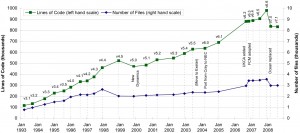
I’m busy revising our paper on the study of the software development processes at the Hadley Centre for publication in CiSE (yay!). And I just looked again at the graph of code growth (click for bigger version):

UM_evolution2

The top line (green) shows lines of code, while the bottom line (blue) shows number of files. When I first produced this figure last summer, I was struck by the almost linear growth in lines of code over the fifteen years (with two obvious hiccups when core modules were replaced). Other studies have shown that lines of code is a good proxy for functionality, so I interpret this as a steady growth in functionality. Which contrasts with Lehman’s observations that for industrial software, an inverse square curve offers the best fit. Lehman offers as an explanation the theory that growing complexity of the software inevitably slows the addition of new functionality. He claims that his pattern is robust in other (commercial) software he has studied (but I’d haven’t trawled through his papers to see if he gives more case studies).

Subsequently, Godfrey & Tu showed that the Linux kernel did not suffer this limitation, but instead grew slightly faster than linearly (or geometrically if you include the device drivers, which you probably shouldn’t). So, that’s two studies that break Lehman’s pattern: the Linux kernel and the Hadley UM. What do they have in common that’s different from the commercial software systems that Lehman studied? I hypothesize the most likely explanation is that in both cases the code is written by the most knowledgeable domain experts, working in a non-hierarchical meritocracy (by which I mean that no one tells them what to work on, and that they get accepted as members of the development team by demonstrating their ability over a period of time). This isn’t a new hypothesis: Dewayne Perry has been saying for ages that domain expertise by the developers is the single biggest factor in project success.

Anyway, my co-author, Tim, was struck quite a different observation about the graph: the way the two lines diverged over the fifteen years shown. While lines of code have grown relatively fast (nearly tenfold over the fifteen years shown), the number of files has grown much more slowly (only threefold). Which means the average filesize has steadily grown too. What does this mean? Roughly speaking, new files mean the addition of new modules, while new lines within an existing file mean additional functionality within existing modules (although this is not quite correct, as scientific programmers don’t always use separate files for separate architectural modules). Which means more of the growth comes from adding complexity within the existing routines, rather than from expanding the model’s scope. I’m willing to bet a lot of that intra-file growth comes from adding lots of different options for different model configurations.

First, we have to be clear what we mean by a climate model. Wikipedia offers a quick intro to types of climate model. For example:

  • zero dimension models, essentially just a set of equations for the earth’s radiation balance
  • 1-dimensional models – for example where you take latitude into account, as the angle of the sun’s rays matter)
  • EMICS – earth-system models of intermediate complexity
  • GCMs – General Circulation Models (a.k.a Global Climate Models), which model the atmosphere in four dimensions (3D+time), by dividing it into a grid of cubes, and solving the equations of fluid motion for each cube at each time step. While the core of a GCM is usually the atmosphere model, GCMs can be coupled to three dimensional ocean models, or run uncoupled, so that you can have A-GCMs (atmosphere only), and AO-GCMs (atmosphere and ocean). Ocean models are just called ocean models 🙂
  • Earth System Models – Take a GCM, and couple it to models of other earth system processes: sea ice, land ice, atmospheric chemistry, the carbon cycle, human activities such as energy consumption and economics, and so on.

Current research tends to focus on Earth System Models, but for the last round of the IPCC assessment, AO-GCMs were used to generate most of the forecast runs. Here are the 23 AO-GCMs used in the IPCC AR4 assessment, with whatever info I could find about availability of each model :

Now, if you were paying attention, you’ll have noticed that that wasn’t 23 bullet points. Some labs contributed runs from more than one version of their model(s), so it does add up somehow.

Short summary: easiest source code to access: (1) IPSL (includes Trac access!), (2) CCSM and (3) ModelE.

Future work: take a look at the additional models that took part in the Coupled Model Inter-comparison Project (CMIP-3), and see if any of them are also available.

Update: RealClimate has started compiling a fuller list of available codes and datasets.

This morning, while doing some research on availability of code for climate models, I came across a set of papers published by the Royal Society in March 2009 reporting on a meeting on the Environmental eScience Revolution. This looks like the best collection of papers I’ve seen yet on the challenges in software engineering for environmental and climate science. These will keep me going for a while, but here are the papers that most interest me:

And I’ll probably have to read the rest as well. Interestingly, I’ve met many of these authors. I’ll have to check whether any followup meetings are planned…

Here’s a very sketchy first second draft for a workshop proposal for the fall. I welcome all comments on this, together with volunteers to be on the organising team. Is this a good title for the workshop? Is the abstract looking good? What should I change?

Update: I’ve jazzed up and rearranged the list of topics, in response to Steffen’s comment to get a better balance between research likely to impact SE itself, vs. research likely to impact other fields.

The First International Workshop on Software Research and Climate Change (WSRCC-1)

In conjunction with: <http://onward-conference.org/> Onward Conference 2009 and <http://www.oopsla.org/oopsla2009/> Oopsla 2009

Workshop website: <http://www.cs.toronto.edu/wsrcc>

ABSTRACT

This workshop will explore the contributions that software research can make to the challenge of climate change. Climate change is likely to be the defining issue of the 21st Century. Recent studies indicate that climate change is accelerating, confirming the most pessimistic of scenarios identified by climate scientists. Our current use of fossil fuels commit the world to around 2°C average temperature rise during this century, and, unless urgent and drastic cuts are made, further heating is likely to trigger any of a number of climate change tipping points. The results will be a dramatic reduction of food production and water supplies, more extreme weather events, the spread of disease, sea level rise, ocean acidification, and mass extinctions. We are faced with the twin challenges of mitigation (avoiding the worst climate change effects by rapidly transitioning the world to a low-carbon economy) and adaptation (re-engineering the infrastructure of modern society so that we can survive and flourish on a hotter planet).

These challenges are global in nature, and pervade all aspects of society. To address them, we will need researchers, engineers, policymakers, and educators from many different disciplines to come the the table and ask what they can contribute. There are both short term challenges (such as how to deploy, as rapidly as possible, existing technology to produce renewable energy; how to design government policies and international treaties to bring greenhouse gas emissions under control) and long term challenges (such as how to complete the transition to a global carbon-neutral society by the latter half of this century). In nearly all these challenges, software has a major role to play as a critical enabling technology.

So, for the software research community, we can frame the challenge as follows: How can we, as experts in software technology, and as the creators of future software tools and techniques, apply our particular knowledge and experience to the challenge of climate change? How can we understand and exploit the particular intellectual assets of our community — our ability to:

  • think computationally;
  • understand and model complex inter-related systems;
  • build useful abstractions and problem decompositions;
  • manage and evolve large-scale socio-technical design efforts;
  • build the information systems and knowledge management tools that empower effective decision-making;
  • develop and verify complex control systems on which we now depend;
  • create user-friendly and task-appropriate interfaces to complex information and communication infrastructures.

In short, how can we apply our research strengths to make significant contributions to the problems of mitigation and adaptation of climate change?

This workshop will be the first in a series, intended to develop a community of researchers actively engaged in this challenge, and to flesh out a detailed research agenda that leverages existing research ideas and capabilities. Therefore we welcome any kind of response to this challenge statement.

WORKSHOP TOPICS

We welcome the active participation of software researchers and practitioners interested in any aspect of this challenge. The participants will themselves determine the scope and thrusts of this workshop, so this list of suggested topics is intended to act only as a starting point:

  • requirements analysis for complex global change problems;
  • integrating sustainability into software system design;
  • green IT, including power-aware computing and automated energy management;
  • developing control systems to create smart energy grids and improve energy conservation;
  • developing information systems to support urban planning, transport policies, green buildings, etc.;
  • software tools for open collaborative science, especially across scientific disciplines;
  • design patterns for successful emissions reduction strategies;
  • social networking tools to support rapid action and knowledge sharing among communities;
  • educational software for hands-on computational science;
  • knowledge management and decision support tools for designing and implementing climate change policies;
  • tools and techniques to accelerate the development and validation of earth system models by climate scientists;
  • data sharing and data management of large scientific datasets;
  • tools for creating and sharing visualizations of climate change data;
  • (more…?)

SUBMISSIONS AND PARTICIPATION

Our intent is to create a lively, interactive discussion, to foster brainstorming and community building. Registration will be open to all. However, we strongly encourage participants to submit (one or more) brief (1-page) responses to the challenge statement, either as:

  • Descriptions of existing research projects relevant to the challenge statement (preferably with pointers to published papers and/or online resources);
  • Position papers outlining potential research projects.

Be creative and forward-thinking in these proposals: think of the future, and think big!

There will be no formal publication of proceedings. Instead we will circulate all submitted papers to participants in advance of the workshop, via the workshop website, and invite participants to revise/update/embellish their contributions in response to everyone else’s contributions. Our plan is to write a post-workshop report, which will draw on both the submitted papers and the discussions during the workshop. This report will lay out a suggested agenda for both short-term and long-term research in response to the challenge, and act as a roadmap for subsequent workshops and funding proposals.

IMPORTANT DATES

Position paper submission deadline: September 25th, 2009

Workshop on Software Research and Climate Change: October 25th or 26th,  2009

WORKSHOP ORGANIZERS

+TBD

I have a couple of PhD theses that I have to read this week, so I probably won’t get to read the new Synthesis Report from the Copenhagen Conference for a few days. But it looks like it will be worth the wait. According to RealClimate, it’s a thorough look at how much the science has changed since the IPCC AR4 report in 2007, along with some serious discussion on what needs to be done to hold the world below the threshold of 2°C of warming.

I gave my talk on SE for the Planet again this afternoon, to the local audience. We recorded it, and will get the whole thing up on the web soon.

I mentioned during the talk that the global greenhouse emissions growth curve and the world population growth curve are almost identical, and speculated that this means effectively that emissions per capita has not changed over the last century or so. After the talk, Jonathan pointed out to me that it means no such thing. While globally the average emissions per capita might have remained roughly constant, the averages probably hide several very different trends. For example, in the industrialized world, emissions per capita appears to have grown dramatically, while population growth has slowed. In contrast, in the undeveloped world the opposite has happened: huge population growth, with very little emissions growth. When you average both trends you get an apparent static per capita emissions rate.

Anyway, this observation prompted me to go back and look at the data. I’d originally found this graph, which appears to show the growth curves are almost identical:

Greenhouse gas emissions versus population growth

Greenhouse gas emissions versus population growth

The problem is, I didn’t check the credibility of the source. The graph comes from the site World Climate Report, which turns out to be a denialist site, full of all sorts of misinformation. In this case, they appear to have cooked the graph (note the low resolution and wide aspect ratio) to make the curves look like they fit much better than they really do. To demonstrate this, I reconstructed them myself.

I got amazingly detailed population data by year from digital survivors. They’ve done a wonderful job of collating data from many different sources, although their averaging technique does lead to the occasional anomaly (e.g. in 1950, there’s a change in availability of source datasets, and it shows up as a tiny glitch on my graph). I got the CO2 emissions data from the US government’s Carbon Dioxide Information Analysis Center (CDIAC).

Here’s the graph from 1850 to 2006 (click it for a higher resolution version):

Notice that emissions grew much more sharply than population from 1950 onwards, with the only exceptions being during the economic recessions of the early 1980’s, early 1990’s, and around 2000. Since 2000, emissions have been growing at more than double the population growth rate. So, I think that effectively explodes the myth that population growth alone explains emissions growth. It also demonstrates the importance of checking your sources before quoting them…

The US government has launched a very swanky new inter-agency website, www.globalchange.gov, intended to act as a central point for news and reports on climate change. And the centre-piece of the launch is a major new report on Climate Change Impacts in the US. It draws on the IPCC reports for much of the science, but it adds to that a lot of detail on how the impacts of climate change are already being seen across the US, and how much worse it’s going to get. Definitely worth reading, especially the parts on drought and heat waves. (The brochures and factsheets are good too)

Add to that a recent report from CNA on Risks to (US) National Security from energy dependence and climate change. It includes some fascinating snippets from senior retired US military admirals and generals, including for example, the threat to the US’s military capacity posed by sea level rise (e.g loss of coastal installations), and disruption to energy supplies. And that the biggest cause of conflict in the 21st century is likely to be mass migrations of entire populations, seeking water and food as supplies dwindle (but if you’ve read Climate Wars, you already knew this)

15. June 2009 · 1 comment · Categories: blogging · Tags:

Ever since I passed about 20 posts, I’ve been wishing for a contents listing for the blog. I think one of the weakest parts of blogging software is poor navigability. The dominant mode of access for most blogs is the (reverse) chronology. Which is fine, because that matches the dominant design metaphor. But it’s implemented badly in most blogging tools – by default you can go backwards one page full of posts at a time, with no ability to get a preview of what’s further back. Some people choose to add shortcuts of various kinds to their blogs: a calendar (actually a month-based index), a list of popular/favourite/recent posts, a list of recent comments, a tag cloud, etc. And of course, you can always search for keywords. These all help to address the navigability problem a little, but none of them really provide the missing synoptic view of past contents.

I think the net result is that blogs have an enforced ephemeral nature – once a post has scrolled off the bottom of the first page, it will probably never be seen by the casual visitor to the site – the only likely paths to it are hardlinks from other blog posts, or google hits.

Which is why I’ve always wanted a contents listing. A page with the titles (&links) to all the past blog posts, arranged in some convenient order. So that casual visitors to the blog can see what they’ve missed. And get a sense of what the blog is all about – a bit like wondering up and down the shelves in a library, except that nobody does that anymore.

Today, I found a tool that does most of what I want. It creates an automated sitemap, for human consumption (as opposed to the machine oriented sitemaps that Google feeds on). It makes use of the category labels, and I think it might take some time for me to figure out how to use the category headings for best effect. But I like it so far. See for yourself

11. June 2009 · 3 comments · Categories: psychology

I’ve been thinking a lot recently about why so few people seem to understand the severity of the climate crisis. Joe Romm argues that it’s a problem of rhetoric: the deniers tend to be excellent at rhetoric, while scientists are lousy at it. He suggests that climate scientists are pretty much doomed to lose in any public debates (and hence debates on this are a bad idea).

But even away from the public stage, it’s very frustrating trying to talk to people who are convinced climate change isn’t real, because, in general, they seem unable to recognize fallacies in their own arguments. One explanation seems to be the Dunning-Kruger effect – a cognitive bias in people’s subjective assessment of their (in)competence. The classic paper is “Unskilled and Unaware of It: How Difficulties in Recognizing One’s Own Incompetence Lead to Inflated Self-Assessments” (for which title, Dunning and Kruger were awarded an IgNoble award in 2000 🙂 ). There’s also a brilliant youtube movie that explains the paper. The bottom line is that people who are most wrong are the least able to perceive it.

In a follow-up paper, they describe a number of experiments that investigate why people fail to recognize their own incompetence. Turns out one of the factors is that people take a “top-down” approach in assessing their competence. People tend to assess how well they did in some task based on their preconceived notions of how good they are at the skills needed, rather than any reflection on their actual performance. For example, in one experiment, the researchers gave subjects a particular test. Some were told it was a test of abstract reasoning ability (which the subjects thought they were good at). Others were told it was a test of programming ability (which the subjects thought they were bad at). It was, of course, the same test, and the subjects from both groups did equally well on it. But their estimation of how well they did depended on what kind of test they thought it was.

There’s also an interesting implication for why women tend to drop out of science and technology careers – women tend to rate themselves as less scientifically talented as men, regardless of their actual performance. This means that, when women are performing just as well as their male colleagues, they will still tend to rate themselves as doing less well, because of this top-down assessment bias.

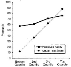
To me, the most interesting part of the research is a whole bunch of graphs that look like this:

dunning-curve1

People who are in the bottom quartile of actual performance tend to dramatically over-estimate how well they did. People in the top quartile tend to slightly under-estimate how well they did.

This explains why scientists have a great difficulty convincing the general public about important matters such as climate change. The most competent scientists will systematically under-estimate their ability, and will be correspondingly modest when presenting their work. The incompetent (e.g. those who don’t understand the science) will tend to vastly over-inflate their professed expertise when presenting their ideas. No wonder the public can’t figure out who to believe. Furthermore, people who just don’t understand basic science also tend not to realize it.

Which also leads me to suggest that if you want to find the most competent people, look for people who tend to underestimate their abilities. It’s rational to believe people who admit they might be wrong.

Disclaimer: psychology is not my field – I might have completely misunderstood all this.