A reader writes to me from New Zealand, arguing that climate science isn’t a science at all because there is no possibility to conduct experiments. This misconception appears to be common, even among some distinguished scientists, who presumably have never taken the time to read many published papers in climatology. The misconception arises because people assume that climate science is all about predicting future climate change, and because such predictions are for decades/centuries into the future, and we only have one planet to work with, we can’t check to see if these predictions are correct until it’s too late to be useful.

In fact, predictions of future climate are really only a by-product of climate science. The science itself concentrates on improving our understanding of the processes that shape climate, by analyzing observations of past and present climate, and testing how well we understand them. For example, detection/attribution studies focus on the detection of changes in climate that are outside the bounds of natural variability (using statistical techniques), and determining how much of the change can be attributed to each of a number of possible forcings (e.g. changes in: greenhouse gases, land use, aerosols, solar variation, etc). Like any science, the attribution is done by creating hypotheses about possible effects of each forcing, and then testing those hypotheses. Such hypotheses can be tested by looking for contradictory evidence (e.g. other episodes in the past where the forcing was present or absent, to test how well the hypothesis explains these too). They can also be tested by encoding each hypothesis in a climate model, and checking how well it simulates the observed data.

I’m not a climate modeler, but I have conducted anthropological studies of how how climate modelers work. Climate models are developed slowly and carefully over many years, as scientific instruments. One of the most striking aspects of climate model development is that it is an experimental science in the strongest sense. What do I mean?

Well, a climate model is a detailed theory of some subset of the earth’s physical processes. Like all theories, it is a simplification that focusses on those processes that are salient to a particular set of scientific questions, and approximates or ignores those processes that are less salient. Climate modelers use their models as experimental instruments. They compare the model run with the observational record for some relevant historical period. They then come up with a hypothesis to explain any divergences between the run and the observational record, and make a small improvement to the model that the hypothesis predicts will reduce the divergence. They then run an experiment in which the old version of the model acts as a control, and the new version is the experimental case. By comparing the two runs with the observational record, they determine whether the predicted improvement was achieved (and whether the change messed anything else up in the process). After a series of such experiments, the modelers will eventually either accept the change to the model as an improvement to be permanently incorporated into the model code, or they discard it because the experiments failed (i.e. they failed to give the expected improvement). By doing this day after day, year after year, the models get steadily more sophisticated, and steadily better at simulating real climactic processes.

This experimental approach has another interesting effect: the software appears to be tested much more thoroughly than most commercial software. Whether this actually delivers higher quality code is an interesting question; however, it is clear that the approach is much more thorough than most industry practices for software regression testing.

I’m delighted to announce that my student, Jonathan Lung has started a blog. Jonathan’s PhD is on how we reduce energy consumption in computing. Unlike much work on green IT, he’s decided to focus on the human behavioural aspects of this, rather than hardware optimization. His first two posts are fascinating:

  • How to calculate if you should print something out or read it on the screen. Since he first did these calculations, we’ve been discussing how you turn this kind of analysis into an open, shared, visual representation, that others can poke and prod, to test the assumptions, customize them to their own context, and discuss. We’ll share more of our design ideas for such a tool in due course.
  • An analysis of whether the iPad is as green as Apple’s marketing claims. Which is, in effect, a special case of the more general calculation of print vs. screen. Oh, and his analysis also makes me feel okay about my desire to own an iPad…

As Jorge points out, this almost completes my set of grad student bloggers. We’ve been experimenting with blogging as a way of structuring research – a kind of open notebook science. Personally, I find it extremely helpful as a way of forcing me to write down ideas (rather than just thinking them), and for furthering discussion of ideas through the comments. And, just as importantly, it’s a way of letting other researchers know about what you’re working on – grad students’ future careers depend on them making a name for themselves in their chosen research community.

Of course, there’s a downside: grad students tend to worry about being “scooped”, by having someone else take their ideas, do the studies, and publish them first. My stock response is something along the lines of “research is 99% perspiration and 1% inspiration” – the ideas themselves, while important, are only a tiny part of doing research. It’s the investigation of the background literature and the implementation (design an empirical study, build a tool, develop a new theory, …etc) that matters. Give the same idea to a bunch of different grad students, and they will all do very different things with it, all of which (if the students are any good) ought to be publishable.

On balance, I think the benefits of blogging your way through grad school vastly outweigh the risks. Now if only my students updated their blogs more regularly… (hint, hint).

Interesting article by Andrew Jones entitled Are we taking supercomputing code seriously?:

Part of the problem is that in their rush to do science, scientists fail to spot the software for what it is: the analogue of the experimental instrument. Consequently, it needs to be treated with the same respect that a physical experiment would receive.

Any reputable physical experiment would ensure the instruments are appropriate to the job and have been tested. They would be checked for known error behaviour in the parameter regions of study, and chosen for their ability to give a satisfactory result within a useful timeframe and budget. Those same principles should apply to a software model.

In a blog post that was picked up by the Huffington post, Bill Gates writes about why we need innovation, not insulation. He sets up the piece as a choice of emphasis between two emissions targets: 30% reduction by 2025, and 80% reduction by 2050. He argues that the latter target is much more important, and hence we should focus on big R&D efforts to innovate our way to zero-carbon energy sources for transportation and power generation. In doing so, he pours scorn on energy conservation efforts, arguing, in effect, that they are a waste of time. Which means Bill Gates didn’t do his homework.

What matters is not some arbitrary target for any given year. What matters is the path we choose to get there. This is a prime example of the communications failure over climate change. Non-scientists don’t bother to learn the basic principles of climate science, and scientists completely fail to get the most important ideas across in a way that helps people make good judgements about strategy.

The key problem in climate change is not the actual emissions in any given year. It’s the cumulative emissions over time. The carbon we emit by burning fossil fuels doesn’t magically disappear. About half is absorbed by the oceans (making them more acidic). The rest cycles back and forth between the atmosphere and the biosphere, for centuries. And there is also tremendous lag in the system. The ocean warms up very slowly, so it take decades for the Earth to reach a new equilibrium temperature once concentrations in the atmosphere stabilize. This means even if we could immediately stop adding CO2 to the atmosphere today, the earth would keep warming for decades, and wouldn’t cool off again for centuries. It’s going to be tough adapting to the warming we’re already committed to. For every additional year that we fail to get emissions under control we compound the problem.

What does this mean for targets? It means that it matters much more how soon we get started on reducing emissions rather than eventual destination at any particular future year. Because any reduction in annual emissions achieved in the next few years means that we save that amount of emissions every year going forward. The longer we take to get the emissions under control, the harder we make the problem.

A picture might help:

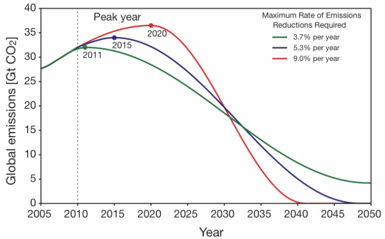
Emissions pathways to give 67% chance of limiting global warming to 2ºC

Three different emissions pathways to give 67% chance of limiting global warming to 2ºC (From the Copenhagen Diagnosis, Figure 22)

The graph shows three different scenarios, each with the same cumulative emissions (i.e. the area under each curve is the same). If we get emissions to peak next year (the green line), it’s a lot easier to keep cumulative emissions under control. If we delay, and allow emissions to continue to rise until 2020, then we can forget about 80% reductions by 2050. We’ll have set ourselves the much tougher task of 100% emissions reductions by 2040!

The thing is, there are plenty of good analyses of how to achieve early emissions reductions by deploying existing technology. Anyone who argues we should put our hopes in some grand future R&D effort to invent new technologies clearly does not understand the climate science. Or perhaps can’t do calculus.

Here’s the abstract for a paper (that I haven’t written) on how to write an abstract:

How to Write an Abstract

The first sentence of an abstract should clearly introduce the topic of the paper so that readers can relate it to other work they are familiar with. However, an analysis of abstracts across a range of fields show that few follow this advice, nor do they take the opportunity to summarize previous work in their second sentence. A central issue is the lack of structure in standard advice on abstract writing, so most authors don’t realize the third sentence should point out the deficiencies of this existing research. To solve this problem, we describe a technique that structures the entire abstract around a set of six sentences, each of which has a specific role, so that by the end of the first four sentences you have introduced the idea fully. This structure then allows you to use the fifth sentence to elaborate a little on the research, explain how it works, and talk about the various ways that you have applied it, for example to teach generations of new graduate students how to write clearly. This technique is helpful because it clarifies your thinking and leads to a final sentence that summarizes why your research matters.

[I’m giving my talk on how to write a thesis to our grad students soon. Can you tell?]

Update 16 Oct 2011: This page gets lots of hits from people googling for “how to write an abstract”. So I should offer a little more constructive help for anyone still puzzling what the above really means. It comes from my standard advice for planning a PhD thesis (but probably works just as well for scientific papers, essays, etc.).

The key trick is to plan your argument in six sentences, and then use these to structure the entire thesis/paper/essay. The six sentences are:

  1. Introduction. In one sentence, what’s the topic? Phrase it in a way that your reader will understand. If you’re writing a PhD thesis, your readers are the examiners – assume they are familiar with the general field of research, so you need to tell them specifically what topic your thesis addresses. Same advice works for scientific papers – the readers are the peer reviewers, and eventually others in your field interested in your research, so again they know the background work, but want to know specifically what topic your paper covers.
  2. State the problem you tackle. What’s the key research question? Again, in one sentence. (Note: For a more general essay, I’d adjust this slightly to state the central question that you want to address) Remember, your first sentence introduced the overall topic, so now you can build on that, and focus on one key question within that topic. If you can’t summarize your thesis/paper/essay in one key question, then you don’t yet understand what you’re trying to write about. Keep working at this step until you have a single, concise (and understandable) question.
  3. Summarize (in one sentence) why nobody else has adequately answered the research question yet. For a PhD thesis, you’ll have an entire chapter, covering what’s been done previously in the literature. Here you have to boil that down to one sentence. But remember, the trick is not to try and cover all the various ways in which people have tried and failed; the trick is to explain that there’s this one particular approach that nobody else tried yet (hint: it’s the thing that your research does). But here you’re phrasing it in such a way that it’s clear it’s a gap in the literature. So use a phrase such as “previous work has failed to address…”. (if you’re writing a more general essay, you still need to summarize the source material you’re drawing on, so you can pull the same trick – explain in a few words what the general message in the source material is, but expressed in terms of what’s missing)
  4. Explain, in one sentence, how you tackled the research question. What’s your big new idea? (Again for a more general essay, you might want to adapt this slightly: what’s the new perspective you have adopted? or: What’s your overall view on the question you introduced in step 2?)
  5. In one sentence, how did you go about doing the research that follows from your big idea. Did you run experiments? Build a piece of software? Carry out case studies? This is likely to be the longest sentence, especially if it’s a PhD thesis – after all you’re probably covering several years worth of research. But don’t overdo it – we’re still looking for a sentence that you could read aloud without having to stop for breath. Remember, the word ‘abstract’ means a summary of the main ideas with most of the detail left out. So feel free to omit detail! (For those of you who got this far and are still insisting on writing an essay rather than signing up for a PhD, this sentence is really an elaboration of sentence 4 – explore the consequences of your new perspective).
  6. As a single sentence, what’s the key impact of your research? Here we’re not looking for the outcome of an experiment. We’re looking for a summary of the implications. What’s it all mean? Why should other people care? What can they do with your research. (Essay folks: all the same questions apply: what conclusions did you draw, and why would anyone care about them?)

The abstract I started with summarizes my approach to abstract writing as an abstract. But I suspect I might have been trying to be too clever. So here’s a simpler one:

(1) In widgetology, it’s long been understood that you have to glomp the widgets before you can squiffle them. (2) But there is still no known general method to determine when they’ve been sufficiently glomped. (3) The literature describes several specialist techniques that measure how wizzled or how whomped the widgets have become during glomping, but all of these involve slowing down the glomping, and thus risking a fracturing of the widgets. (4) In this thesis, we introduce a new glomping technique, which we call googa-glomping, that allows direct measurement of whifflization, a superior metric for assessing squiffle-readiness. (5) We describe a series of experiments on each of the five major types of widget, and show that in each case, googa-glomping runs faster than competing techniques, and produces glomped widgets that are perfect for squiffling. (6) We expect this new approach to dramatically reduce the cost of squiffled widgets without any loss of quality, and hence make mass production viable.

When I was visiting MPI-M earlier this month, I blogged about the difficulty of documenting climate models. The problem is particularly pertinent to questions of model validity and reproducibility, because the code itself is the result of a series of methodological choices by the climate scientists, which are entrenched in their design choices, and eventually become inscrutable. And when the code gets old, we lose access to these decisions. I suggested we need a kind of literate programming, which sprinkles the code among the relevant human representations (typically bits of physics, formulas, numerical algorithms, published papers), so that the emphasis is on explaining what the code does, rather than preparing it for a compiler to digest.

The problem with literate programming (at least in the way it was conceived) is that it requires programmers to give up using the program code as their organising principle, and maybe to give up traditional programming languages altogether. But there’s a much simpler way to achieve the same effect. It’s to provide an organising structure for existing programming languages and tools, but which mixes in non-code objects in an intuitive way. Imagine you had an infinitely large sheet of paper, and could zoom in and out, and scroll in any direction. Your chunks of code are laid out on the paper, in an spatial arrangement that means something to you, such that the layout helps you navigate. Bits of documentation, published papers, design notes, data files, parameterization schemes, etc can be placed on the sheet, near to the code that they are relevant to. When you zoom in on a chunk of code, the sheet becomes a code editor; when you zoom in on a set of math formulae, it becomes a LaTeX editor, and when you zoom in on a document it becomes a word processor.

Well, Code Canvas, a tool under development in Rob Deline‘s group at Microsoft Research does most of this already. The code is laid out as though it was one big UML diagram, but as you zoom in you move fluidly into a code editor. The whole thing appeals to me because I’m a spatial thinker. Traditional IDEs drive me crazy, because they separate the navigation views from the code, and force me to jump from one pane to another to navigate. In the process, they hide the inherent structure of a large code base, and constrain me to see only a small chunk at a time. Which means these tools create an artificial separation between higher level views (e.g. UML diagrams) and the code itself, sidelining the diagrammatic representations. I really like the idea of moving seamlessly back and forth between the big picture views and actual chunks of code.

Code Canvas is still an early prototype, and doesn’t yet have the ability to mix in other forms of documentation (e.g. LaTeX) on the sheet (or at least not in any demo Microsoft are willing to show off), but the potential is there. I’d like to explore how we take an idea like this an customize it for scientific code development, where there is less of a strict separation of code and data than in other forms of programming, and where the link to published papers and draft reports is important. The infinitely zoomable paper could provide an intuitive unifying tool to bring all these different types of object together in one place, to be managed as a set. And the use of spatial memory to help navigate will be helpful, when the set of things gets big.

I’m also interested in exploring the idea of using this metaphor for activities that don’t involve coding – for example complex decision-support for sustainability, where you need to move between spreadsheets, graphs & charts, models runs, and so on. I would lay out the basic decision task as a graph on the sheet, with sources of evidence connecting into the decision steps where they are needed. The sources of evidence could be text, graphs, spreadsheet models, live datafeeds, etc. And as you zoom in over each type of object, the sheet turns into the appropriate editor. As you zoom out, you get to see how the sources of evidence contribute to the decision-making task. Hmmm. Need a name for this idea. How about DecisionCanvas?

Update: Greg also pointed me to CodeBubbles and Intentional Software

Many moons ago, I talked about the danger of being distracted by our carbon footprints. I argued that the climate crisis cannot be solved by voluntary action by the (few) people who understand what we’re facing. The problem is systemic, and so adequate responses must be systemic too.

In the years since 9/11, it’s gotten steadily more frustrating to fly, as the lines build up at the security checkpoints, and we have to put more and more of what we’re wearing through the scanners. This doesn’t dissuade people from flying, but it does make them much more grumpy about it. And it doesn’t make them any safer, either. Bruce Schneier calls it “Security Theatre“: countermeasures that make it look like something is being done at the airport, but which make no difference to actual security. Bruce runs a regular competition to think up a movie plot that will create a new type of fear and hence enable the marketing of a new type of security theatre countermeasure.

Now Jon Udell joins the dots and points out that we have an equivalent problem in environmentalism: Carbon Theatre. Except that he doesn’t quite push the concept far enough. In Jon’s version, carbon theatre is competitions and online quizes and so on, in which we talk about how we’re going to reduce our carbon footprints more than the next guy, rather than actually getting on and doing things that make a difference.

I think carbon theatre is more insidious than that. It’s the very idea that an appropriate response to climate change is to make personal sacrifices. Like giving up flying. And driving. And running the air conditioner. And so on. The problem is, we approach these things like a dieter approaches the goal of losing weight. We make personal sacrifices that are simply not sustainable. For most people, dieting doesn’t work. It doesn’t work because, although the new diet might be healthier, it’s either less convenient or less enjoyable. Which means sooner or later, you fall off the wagon, because it’s simply not possible to maintain the effort and sacrifice indefinitely.

Carbon theatre means focussing on carbon footprint reduction without fixing the broader system that would make such changes sustainable. You can’t build a solution to climate change by asking people to give up the conveniences of modern life. Oh, sure, you can get people to set personal goals, and maybe even achieve them (temporarily). But if it requires a continual effort to sustain, you haven’t achieved anything. If it involves giving up things that you enjoy, and that others around you continue to enjoy, then it’s not a sustainable change.

I’ve struggled for many years to justify the fact that I fly a lot. A few long-haul flights in a year adds enough to my carbon footprint that just about anything else I do around the house is irrelevant. Apparently a lot of scientists worry about this too.When I blogged about the AGU meeting, the first comment worried about the collective carbon footprint of all those scientists flying to the meeting. George Marshall worries that this undermines the credibility of climate scientists (or maybe he’s even arguing that it means climate scientists still don’t really believe their own results). Somehow all these people seem to think it’s more important for climate scientists to give up flying than it is for, say, investment bankers or oil company executives. Surely that’s completely backwards??

This is, of course, the wrong way to think about the problem. If climate scientists unilaterally give up flying, it will make no discernible difference to the global emissions of the airline industry. And it will make the scientists a lot less effective, because it’s almost impossible to do good science without the networking and exchange of ideas that goes on at scientific conferences. And even if we advocate that everyone who really understands the magnitude of the climate crisis also gives up flying, it still doesn’t add up to a useful solution. We end up giving the impression that if you believe that climate change is a serious problem you have to make big personal sacrifices. Which makes it just that much harder for many people to accept that we do have a problem.

For example, I’ve tried giving up short haul flights in favour of taking the train. But often the train is more expensive and more hassle. If there is no direct train service to my destination, it’s difficult to plan a route, buy tickets, and the trains are never timed to connect in the right way. By making the switch, I’m inconveniencing myself, for no tangible outcome. I’d be far more effective getting together with others who understand the problem, and fixing the train system to make it cheaper and easier. Or helping existing political groups who are working towards this goal. If we make the train cheaper and easier than flying, it will be easy to persuade large number of people to switch as well.

So, am I arguing that working on our carbon footprints is a waste of time? Well, yes and no. It’s a waste of time if you’re doing it by giving up stuff that you’d rather not give up. However, it is worth it if you find a way to do it that could be copied by millions of other people with very little effort. In other words, if it’s not (massively) repeatable and sustainable, it’s probably a waste of time. We need changes that scale up, and we need to change the economic and policy frameworks to support such changes. That won’t happen if the people who understand what needs doing focus inwards on their own personal footprints. We have to think in terms of whole systems.

There is a caveat: sacrifices such as temporarily giving up flying are worthwhile if done as a way of understanding the role of flying in our lives, and the choices we make about travel; they might also be worthwhile if done as part of a coordinated political campaign to draw attention to a problem. But as a personal contribution to carbon reduction? That’s just carbon theatre.

Weather and climate are different. Weather varies tremendously from day to day, week to week, season to season. Climate, on the other hand is average weather over a period of years; it can be thought of as the boundary conditions on the variability of weather. We might get an extreme cold snap, or a heatwave at a particular location, but our knowledge of the local climate tells us that these things are unusual, temporary phenomena, and sooner or later things will return to normal. Forecasting the weather is therefore very different from forecasting changes in the climate. One is an initial value problem, and the other is a boundary value problem. Let me explain.

Good weather forecasts depend upon an accurate knowledge of the current state of the weather system. You gather as much data you can about current temperatures, winds, clouds, etc., feed them all into a simulation model and then run it forward to see what happens. This is hard because the weather is an incredibly complex system. The amount of information needed is huge: both the data and the models are incomplete and error-prone. Despite this, weather forecasting has come a long way over the past few decades. Through a daily process of generating forecasts, comparing them with what happened, and thinking about how to reduce errors, we have incredibly accurate 1- and 3- day temperature forecasts. Accurate forecasts of rain, snow, and so on for a specific location is a little harder because of the chance that the rainfall will be in a slightly different place (e.g a few kilometers away) or a slightly different time than the model forecasts, even if the overall amount of precipitation is right. Hence, daily forecasts give fairly precise temperatures, but put probabilistic values on things like rain (Probability of Precipitation, PoP), based on knowledge of the uncertainty factors in the forecast. The probabilities are known because we have a huge body of previous forecasts to compare with.

The limit on useful weather forecasts seems to be about one week. There are inaccuracies and missing information in the inputs, and the models are only approximations of the real physical processes. Hence, the whole process is error prone. At first these errors tend to be localized, which means the forecast for the short term (a few days) might be wrong in places, but is good enough in most of the region we’re interested in to be useful. But the longer we run the simulation for, the more these errors multiply, until they dominate the computation. At this point, running the simulation for longer is useless. 1-day forecasts are much more accurate than 3-day forecasts, which are better than 5-day forecasts, and beyond that it’s not much better than guessing. However, steady improvements mean that 3-day forecasts are now as accurate as 2-day forecasts were a decade ago. Weather forecasting centres are very serious about reviewing the accuracy of their forecasts, and set themselves annual targets for accuracy improvements.

A number of things help in this process of steadily improving forecasting accuracy. Improvements to the models help, as we get better and better at simulating physical processes in the atmosphere and oceans. Advances in high performance computing help too – faster supercomputers mean we can run the models at a higher resolution, which means we get more detail about where exactly energy (heat) and mass (winds, waves) are moving. But all of these improvements are dwarfed by the improvements we get from better data gathering. If we had more accurate data on current conditions, and could get it into the models faster, we could get big improvements in the forecast quality. In other words, weather forecasting is an “initial value” problem. The biggest uncertainty is knowledge of the initial conditions.

One result of this is that weather forecasting centres (like the UK Met Office) can get an instant boost to forecasting accuracy whenever they upgrade to a faster supercomputer. This is because the weather forecast needs to be delivered to a customer (e.g. a newspaper or TV station) by a fixed deadline. If the models can be made to run faster, the start of the run can be delayed, giving the meteorologists more time to collect newer data on current conditions, and more time to process this data to correct for errors, and so on. For this reason, the national weather forecasting services around the world operate many of the world’s fastest supercomputers.

Hence weather forecasters are strongly biased towards data collection as the most important problem to tackle. They tend to regard computer models as useful, but of secondary importance to data gathering. Of course, I’m generalizing – developing the models is also a part of meteorology, and some meteorologists devote themselves to modeling, coming up with new numerical algorithms, faster implementations, and better ways of capturing the physics. It’s quite a specialized subfield.

Climate science has the opposite problem. Using pretty much the same model as for numerical weather prediction, climate scientists will run the model for years, decades or even centuries of simulation time. After the first few days of simulation, the similarity to any actual weather conditions disappears. But over the long term, day-to-day and season-to-season variability in the weather is constrained by the overall climate. We sometimes describe climate as “average weather over a long period”, but in reality it is the other way round – the climate constrains what kinds of weather we get.

For understanding climate, we no longer need to worry about the initial values, we have to worry about the boundary values. These are the conditions that constraint the climate over the long term: the amount of energy received from the sun, the amount of energy radiated back into space from the earth, the amount of energy absorbed or emitted from oceans and land surfaces, and so on. If we get these boundary conditions right, we can simulate the earth’s climate for centuries, no matter what the initial conditions are. The weather itself is a chaotic system, but it operates within boundaries that keep the long term averages stable. Of course, a particularly weird choice of initial conditions will make the model behave strangely for a while, at the start of a simulation. But if the boundary conditions are right, eventually the simulation will settle down into a stable climate. (This effect is well known in chaos theory: the butterfly effect expresses the idea that the system is very sensitive to initial conditions, and attractors are what cause a chaotic system to exhibit a stable pattern over the long term)

To handle this potential for initial instability, climate modellers create “spin-up” runs: pick some starting state, run the model for say 30 years of simulation, until it has settled down to a stable climate, and then use the state at the end of the spin-up run as the starting point for science experiments. In other words, the starting state for a climate model doesn’t have to match real weather conditions at all; it just has to be a plausible state within the bounds of the particular climate conditions we’re simulating.

To explore the role of these boundary values on climate, we need to know whether a particular combination of boundary conditions keep the climate stable, or tend to change it. Conditions that tend to change it are known as forcings. But the impact of these forcings can be complicated to assess because of feedbacks. Feedbacks are responses to the forcings that then tend to amplify or diminish the change. For example, increasing the input of solar energy to the earth would be a forcing. If this then led to more evaporation from the oceans, causing increased cloud cover, this could be a feedback, because clouds have a number of effects: they reflect more sunlight back into space (because they are whiter than the land and ocean surfaces they cover) and they trap more of the surface heat (because water vapour is a strong greenhouse gas). The first of these is a negative feedback (it reduces the surface warming from increased solar input) and the second is a positive feedback (it increases the surface warming by trapping heat). To determine the overall effect, we need to set the boundary conditions to match what we know from observational data (e.g. from detailed measurements of solar input, measurements of greenhouse gases, etc). Then we run the model and see what happens.

Observational data is again important, but this time for making sure we get the boundary values right, rather than the initial values. Which means we need different kinds of data too – in particular, longer term trends rather than instantaneous snapshots. But this time, errors in the data are dwarfed by errors in the model. If the algorithms are off even by a tiny amount, the simulation will drift over a long climate run, and it stops resembling the earth’s actual climate. For example, a tiny error in calculating where the mass of air leaving one grid square goes could mean we lose a tiny bit of mass on each time step. For a weather forecast, the error is so small we can ignore it. But over a century long climate run, we might end up with no atmosphere left! So a basic test for climate models is that they conserve mass and energy over each timestep.

Climate models have also improved in accuracy steadily over the last few decades. We can now use the known forcings over the last century to obtain a simulation that tracks the temperature record amazingly well. These simulations demonstrate the point nicely. They don’t correspond to any actual weather, but show patterns in both small and large scale weather systems that mimic what the planet’s weather systems actually do over the year (look at August – see the the daily bursts of rainfall in the Amazon, the gulf stream sending rain to the UK all summer long, and the cyclones forming off the coast of Japan by the middle of the month). And these patterns aren’t programmed into the model – it is all driven by sets of equations derived from the basic physics. This isn’t a weather forecast, because on any given day, the actual weather won’t look anything like this. But it is an accurate simulation of typical weather over time (i.e. climate). And, as was the case with weather forecasts, some bits are better than others – for example the Indian monsoons tend to be less well-captured than the North Atlantic Oscillation.

At first sight, numerical weather prediction and climate models look very similar. They model the same phenomena (e.g. how energy moves around the planet via airflows in the atmosphere and currents in the ocean), using the same computational techniques (e.g., three dimensional models of fluid flow on a rotating sphere). And quite often they use the same program code. But the problems are completely different: one is an initial value problem, and one is a boundary value problem.

Which also partly explains why a small minority of (mostly older, mostly male) meteorologists end up being climate change denialists. They fail to understand the difference in the two problems, and think that climate scientists are misusing the models. They know that the initial value problem puts serious limits on our ability to predict the weather, and assume the same limit must prevent the models being used for studying climate. Their experience tells them that weaknesses in our ability to get detailed, accurate, and up-to-date data about current conditions is the limiting factor for weather forecasting, and they assume this limitation must be true of climate simulations too.

Ultimately, such people tend to suffer from “senior scientist” syndrome: a lifetime of immersion in their field gives them tremendous expertise in that field, which in turn causes them to over-estimate how well their expertise transfers to a related field. They can become so heavily invested in a particular scientific paradigm that they fail to understand that a different approach is needed for different problem types. This isn’t the same as the Dunning-Kruger effect, because the people I’m talking about aren’t incompetent. So perhaps we need a new name. I’m going to call it the Dyson-effect, after one of it’s worst sufferers.

I should clarify that I’m certainly not stating that meteorologists in general suffer from this problem (the vast majority quite clearly don’t), nor am I claiming this is the only reason why a meteorologist might be skeptical of climate research. Nor am I claiming that any specific meteorologists (or physicists such as Dyson) don’t understand the difference between initial value and boundary value problems. However, I do think that some scientists’ ideological beliefs tend to bias them to be dismissive of climate science because they don’t like the societal implications, and the Dyson-effect disinclines them to finding out what climate science actually does.

I am, however, arguing that if more people understood this distinction between the two types of problem, we could get past silly soundbites about “we can’t even forecast the weather…” and “climate models are garbage in garbage out”, and have a serious conversation about how climate science works.

Update: Zeke has a more detailed post on the role of parameterizations climate models.

I picked up Stephen Schneider’s “Science as a Contact Sport” to read on travel this week. I’m not that far into it yet (it’s been a busy trip), but was struck by a comment in chapter 1 about how he got involved in climate modeling. In the late 1960’s, he was working on his PhD thesis in plasma physics, and (in his words) “knew how to calculate magneto-hydro-dynamic shocks at 20,000 times the speed of sound”, with “one-and-a-half dimensional models of ionized gases” (Okay, I admit it, I have no idea what that means, but it sounds impressive)…

…Anyway, along comes Joe Smagorinsky from Princeton, to give a talk on the challenges of modeling the atmosphere as a three-dimensional fluid flow problem on a rotating sphere, and Schneider is immediately fascinated by both the mathematical challenges and the potential of this as important and useful research. He goes on to talk about the early modeling work and the mis-steps made in the early 1970’s on figuring out whether the global cooling from aerosols would be stronger than the global warming from greenhouse gases, and getting the relative magnitudes wrong by running the model without including the stratosphere. And how global warming denialists today like to repeat the line about “first you predicted global cooling, then you predicted global warming…” without understanding that this is exactly how science proceeds, by trying stuff, making mistakes, and learning from them. Or as Ms. Frizzle would say, “Take chances! Make Mistakes! Get Messy!” (No, Schneider doesn’t mention Magic School Bus in the book. He’s too old for that).

Anyway, I didn’t get much further reading the chapter, because my brain decided to have fun with the evocative phrase “modeling the atmosphere as a three-dimensional fluid flow problem on a rotating sphere”, which is perhaps the most succinct description I’ve heard yet of what a climate model is. And what would happen if Ms. Frizzle got hold of this model and encouraged her kids to “get messy” with it. What would they do?

Let’s assume the kids can run the model, and play around with its settings. Let’s assume that they have some wonderfully evocative ways of viewing the outputs too, such as these incredible animations of precipitation from a model (my favourite is “August“) from NCAR, and where greenhouse gases go after we emit them (okay, the latter was real data, rather than a model, but you get the idea).

What experiments might the kids try with the model? How about:

  1. Stop the rotation of the earth. What happens to the storms? Why? (we’ll continue to ask “why?” for each one…)
  2. Remove the land-masses. What happens to the gulf stream?
  3. Remove the ice at the poles. What happens to polar temperatures? Why? (we’ll switch to a different visualization for this one)
  4. Remove all CO2 from the atmosphere. How much colder is the earth? Why? What happens if you leave it running?
  5. Erupt a whole bunch of volcanoes all at once. What happens? Why? How long does the effect last? Does it depend on how many volcanoes you use?
  6. Remove all human activity (i.e. GHG emissions drop to zero instantly). How long does it take for the greenhouse gases to return to the levels they were at before the industrial revolution? Why?
  7. Change the tilt of the earth’s axis a bit. What happens to seasonal variability? Why? Can you induce an ice age? If so, why?
  8. Move the earth a little closer to the sun. What happens to temperatures? How long do they take to stabilize? Why that long?
  9. Burn all the remaining (estimated) reserves of fossil fuels all at once. What happens to temperatures? Sea levels? Polar ice?
  10. Set up the earth as it was in the last ice age. How much colder are global temperatures? How much colder are the poles? Why the difference? How much colder is it where you live?
  11. Melt all the ice at the poles (by whatever means you can). What happens to the coastlines near where you live? Over the rest of your continent? Which country loses the most land area?
  12. Keep CO2 levels constant at the level they were at in 1900, and run a century-long simulation. What happens to temperatures? Now try keeping aerosols constant at 1900 levels instead. What happens? How do these two results compare to what actually happened?

Now compare your answers with what the rest of the class got. And discuss what we’ve learned. [And finally, for the advanced students – look at the model software code, and point to the bits that are responsible for each outcome… Okay, I’m just kidding about that bit. We’d need literate code for that].

Okay, this seems like a worthwhile project. We’d need to wrap a desktop-runnable model in a simple user interface with the appropriate switches and dials. But is there any model out there that would come anywhere close to being useable in a classroom situation for this kind of exercise?

(feel free to suggest more experiments in the comments…)

This week I’m visiting the Max Planck Institute for Meteorology (MPI-M) in Hamburg. I gave my talk yesterday on the Hadley study, and it led to some fascinating discussions about software practices used for model building. One of the topics that came up in the discussion afterwards was how this kind of software development compares with agile software practices, and in particular the reliance on face-to-face communication, rather than documentation. Like many software projects, climate modellers struggle to keep good, up-to-date documentation, but generally feel they should be doing better. The problem of course, is that traditional forms of documentation (e.g. large, stand-alone descriptions of design and implementation details) are expensive to maintain, and of questionable value – the typical experience is that you wade through the documentation and discover that despite all the details, it never quite answers your question. Such documents are often produced in a huge burst of enthusiasm for the first release of the software, but then never touched again through subsequent releases. And as the code in the climate models evolves steadily over decades, the chances of any stand-alone documentation keeping up are remote.

An obvious response is that the code itself should be self-documenting. I’ve looked at a lot of climate model code, and readability is somewhat variable (to put it politely). This could be partially addressed with more attention to coding standards, although it’s not clear how familiar you would have to be with the model already to be able to read the code, even with very good coding standards. Initiatives like Clear Climate Code intend to address this problem, by re-implementing climate tools as open source projects in Python, with a strong focus on making the code as understandable as possible. Michael Tobis and I have speculated recently about how we’d scale up this kind of initiative to the development of coupled GCMs.

But readable code won’t fill the need for a higher level explanation of the physical equations and their numerical approximations used in the model, along with rationale for algorithm choices. These are often written up in various forms of (short) white papers when the numerical routines are first developed, and as these core routines rarely change, this form of documentation tends to remain useful. The problem is that these white papers tend to have no official status (or perhaps at best, they appear as technical reports), and are not linked in any usable way to distributions of the source code. The idea of literate programming was meant to solve this problem, but it never took off, probably because it demands that programmers must tear themselves away from using programming languages as their main form of expression, and start thinking about how to express themselves to other human beings. Given that most programmers define themselves in terms of the programming languages they are fluent in, the tyranny of the source code is unlikely to disappear anytime soon. In this respect, climate modelers have a very different culture from most other kinds of software development teams, so perhaps this is an area where the ideas of literate programming could take root.

Lack of access to these white papers could also be solved by publishing them as journal papers (thus instantly making them citeable objects). However, scientific journals tend not to publish descriptions of the designs of climate models, unless they are accompanied with new scientific results from the models. There are occasional exceptions (e.g. see the special issue of the Journal of Climate devoted to the MPI-M models). But things are changing, with the recent appearance of two new journals:

  • Geoscientific Model Development, an open access journal that accepts technical descriptions of the development and evaluation of the models;
  • Earth Science Informatics, a Springer Journal with a broader remit than GMD, but which does cover descriptions of the development of computational tools for climate science.

The problem is related to another dilemma in climate modeling groups: acknowledgement for the contributions of those who devote themselves more to model development rather than doing “publishable science”. Most of the code development is done by scientists whose performance is assessed by their publication record. Some modeling centres have created job positions such as “programmers” or “systems staff”, although most people hired into these roles have a very strong geosciences background. A growing recognition of the importance of their contributions represents a major culture change in the climate modeling community over the last decade.

The highlight of the whole conference for me was the Wednesday afternoon session on Methodologies of Climate Model Confirmation and Interpretation, and the poster session the following morning on the same topic, at which we presented Jon’s poster.  Here’s my notes from the Wednesday session.

Before I dive in, I will offer a preamble for people unfamiliar with recent advances in climate models (or more specifically, GCMs) and how they are used in climate science. Essentially, these are massive chunks of software that simulate the flow of mass and energy in the atmosphere and oceans (using a small set of physical equations), and then couple these to simulations of biological and chemical processes, as well as human activity. The climate modellers I’ve spoken to are generally very reluctant to have their models used to generate predictions of future climate – the models are built to help improve our understanding of climate processes, rather than to make forecasts for planning purposes. I was rather struck by the attitude of the modellers at the Hadley centre at the meetings I sat in on last summer in the early planning stages for the next IPCC reports – basically, it was “how can we get the requested runs out of the way quickly so that we can get back to doing our science”. Fundamentally, there is a significant gap between the needs of planners and policymakers for detailed climate forecasts (preferably with the uncertainties quantified), and the kinds of science that the climate models support.

Climate models do play a major role in climate science, but sometimes that role is over-emphasized. Hansen lists climate models third in his sources of understanding of climate change, after (1) paleoclimate and (2) observations of changes in the present and recent past. This seems about right – the models help to refine our understanding and ask “what if…” questions, but are certainly only one of many sources of evidence for AGW.

Two trends in climate modeling over the past decade or so are particularly interesting: the push towards higher and higher resolution models (which thrash the hell out of supercomputers), and the use of ensembles:

  • Higher resolution models (i.e. resolving the physical processes over a finer grid) offer the potential for more detailed analysis of impacts on particular regions (whereas older models focussed on global averages). The difficulty is that higher resolution requires much more computing power, and the higher resolution doesn’t necessarily lead to better models, as we shall see…
  • Ensembles (i.e. many runs of either a single model, or of a collection of different models) allow us to do probabilistic analysis, for example to explore the range of probabilities of future projections. The difficulty, which came up a number of times in this session, is that such probabilities have to be interpreted very carefully, and don’t necessarily mean what they appear to mean.

Much of the concern is over the potential for “big surprises” – the chance that actual changes in the future will lie well outside the confidence intervals of these probabilistic forecasts (to understand why this is likely, you’ll have to read on to the detailed notes). And much of the concern is with the potential for surprises where the models dramatically under-estimate climate change and its impacts. Climate models work well at simulating 20th Century climate. But the more the climate changes in the future, the less certain we can be that the models capture the relevant processes accurately. Which is ironic, really: if the climate wasn’t changing so dramatically, climate models could give very confident predictions of 21st century climate. It’s at the upper end of projected climate changes where the most uncertainty lies, and this is the scary stuff. It worries the heck out of many climatologists.

Much of the question is to do with adequacy for answering particular questions about climate change. Climate models are very detailed hypotheses about climate processes. They don’t reproduce past climate precisely (because of many simplifications). But they do simulate past climate reasonably well, and hence are scientifically useful. It turns out that investigating areas of divergence (either from observations, or from other models) leads to interesting new insights (and potential model improvements).

Okay, with that as an introduction, on to my detailed notes from the session (be warned: it’s a long post). More »

I’m still only halfway through getting my notes from the AGU meeting turned into blog posts. But the Christmas vacation intervened. I’m hoping to get the second half of the conference blogged over the next week or so, but in the meantime, I thought I’d share these tidbits:

  1. A kid’s-eye view of the AGU. My kids (well, 2/3 of them) accompanied me to the AGU meeting and had great fun interviewing climate scientists. The interviews they videoed were great, but unfortunately the sound quality sucks (you know what noisy conference venues are like). I’ll see if we can edit them into something usable…
  2. I’m a geoblogger! On the Wednesday lunchtime, the AGU hosted a lunch for “geobloggers“, complete with a show-and-tell by each blogger. There’s a nice write up on the AGU blog of the lunch, including a snippet of Julie’s graphical summary with Serendipity right at the centre:

geoblogging lunch

Wednesday morning also saw the poster session “IN31B – Emerging Issues in e-Science: Collaboration, Provenance, and the Ethics of Data”. I was presenting Alicia‘s poster on open science and reproducibility:

Identifying Communication Barriers to Scientific Collaboration (click for fullsize)

Identifying Communication Barriers to Scientific Collaboration (click for fullsize)

The poster summarizes Alicia’s master’s thesis work – a qualitative study of what scientists think about open science and reproducibility, and how they use these terms (Alicia’s thesis will be available real soon now). The most interesting outcome of the study for me was the realization that innocent sounding terms such as “replication” mean very different things to different scientists. For example, when asked how many experiments in their field are replicated, and how many should be replicated, the answers are all over the map. One reason is that the term “experiment” can have vastly different meanings to different people, from a simple laboratory procedure that might take an hour or so, to a journal-paper sized activity spanning many months. Another reason is that it’s not always clear what it means to “replicate” an experiment. To some people it means following the original experimental procedure exactly to try to generate the same results, while to others, replication includes different experiments intended to test the original result in a different way.

Once you’ve waded through the different meanings, there still seems to be a range of opinion on the desirability of frequent replication. In many fields (including my field, software engineering) there are frequent calls for more replication, along with complaints about the barriers (e.g. some journals won’t accept papers reporting replications because they’re not ‘original’ enough). However, on the specific question of how many published studies should be replicated, an answer other than “100%” is quite defensible: some published experiments are dead-ends (research questions that should not be pursued further), and some are just bad experiments (experimental designs that in hindsight were deeply flawed). And then there’s the opportunity cost – instead of replicating an experiment for a very small knowledge gain, it’s often better to design a different experiment to probe new aspects of the same theory, for a much larger knowledge gain. We reflected on some of these issues in our ICSE’2008 paper On the Difficulty of Replicating Human Subjects Studies in Software Engineering.

Anyway, I digress. Alicia’s study also revealed a number of barriers to sharing data, suggesting that some of the stronger calls for open science and reproducibility standards are, at least currently, too impractical. At a minimum, we need better tools for capturing data provenance and scientific workflows. But more importantly, we need to think more about the balance of effort – a scientist who has spent many years developing a dataset needs the appropriate credit for this effort (currently, we only tend to credit the published papers based on the data), and perhaps even some rights to exploit the dataset for their own research first, before sharing. And for large, complex datasets, there’s the balance between ‘user support’ as other people try to use the data and have many questions about it, versus getting on with your own research. I’ve already posted about an extreme case in climate science, where such questions can be used strategically in a kind of denial of service attack. The bottom line is that while in principle, openness and reproducibility are important cornerstones of scientific process, in practice there are all sorts of barriers, most of which are poorly understood.

Alicia’s poster generated a huge amount of interest, and I ended up staying around the poster area for much longer than I expected, having all sorts of interesting conversations. Many people stopped by to ask questions about the results described on the poster, especially the tables (which seemed to catch everyone’s attention). I had a fascinating chat with Paulo Pinheiro da Silva, from UT El Paso, whose Cyber-Share project is probing many of these issues, especially the question of whether knowledge provenance and semantic web techniques can be used to help establish trust in scientific artefacts (e.g. datasets). We spent some time discussing what is good and bad about current metadata projects, and the greater challenge of capturing the tacit knowledge scientists have about their datasets. Also chatted briefly with Peter Fox, of Rensselaer, who has some interesting example use cases for where scientists need to do search based on provenance rather than (or in addition to) content.

This also meant that I didn’t get anywhere near enough time to look at the other posters in the session. All looked interesting, so I’ll list them here to remind me to follow up on them:

  • IN31B-1001. Provenance Artifact Identification and Semantic Tagging in the Atmospheric Composition Processing System (ACPS), by Curt Tilmes of NASA GSFC.
  • IN31B-1002. Provenance-Aware Faceted Search, by Deborah McGuinness et. al. of RPI (this was the work Peter Fox was telling me about)
  • IN31B-1003. Advancing Collaborative Climate Studies through Globally Distributed Geospatial Analysis, by Raj Singh of the Open Geospatial Consortium.
  • IN31B-1005. Ethics, Collaboration, and Presentation Methods for Local and Traditional Knowledge for Understanding Arctic Change, by Mark Parsons of the NSIDC.
  • IN31B-1006. Lineage management for on-demand data, by Mary Jo Brodzik, also of the NSIDC.
  • IN31B-1007. Experiences Developing a Collaborative Data Sharing Portal for FLUXNET, by Deb Agarwal of Lawrence Berkeley Labs.
  • IN31B-1008. Ignored Issues in e-Science: Collaboration, Provenance and the Ethics of Data, by Joe Hourclé, of NASA GSFC
  • IN31B-1009. IsoMAP (Isoscape Modeling, Analysis, and Prediction), by Chris Miller, of Purdue

Picking up from my last post on communicating with policymakers, the first session on Wednesday morning was on science literacy (or rather, lack of it) in America. The session was packed full of interesting projects.

Frank Niepold from NOAA kicked off the session, presenting the results from an NSF-led study on climate literacy. They have developed some draft goals for a national strategy, and a very nice booklet. The NOAA Climate Program Office has pointers to a useful set of additional material, and there is a fuller account of the development of this initiative in the AAAS interview with Frank. An interesting point was that literacy in this initiative means actionable stuff – a sufficient understanding of climate change to result in behavioural change. The brochures are interesting and useful, but it looks like they’ve got a long way to go to make it actionable.

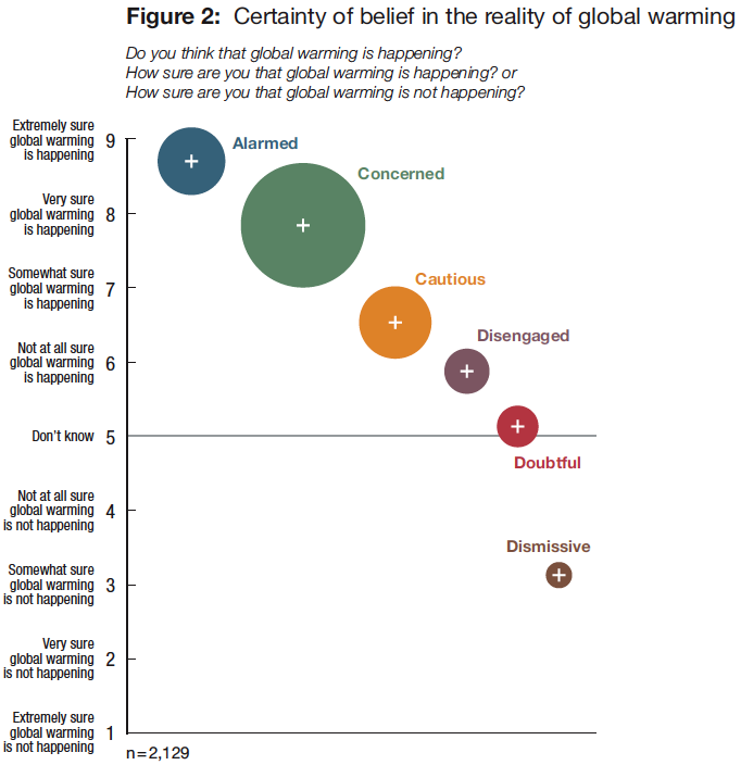
Connie Roser-Renouf then presented a brilliant 15 minute summary of the fascinating study Global Warming’s Six Americas: An Audience Segmentation Analysis. The study sampled 2129 people from 40,000 respondents in a nationwide survey. Latent class analysis was used to cluster people according to their beliefs, attitudes, etc. [I like this tidbit: 2% of respondents said they’d never heard of global warming]. I already posted a little about this on Sunday, but I find the study sufficiently fascinating that it’s worth looking at in more depth.

Six Americas study, figure 2

Remember, the size of the circles represent the proportion of each group in the sample, and the six groups were identified by cluster analysis on a range of attitudes. Quite clearly the vast majority of respondents understand that global warming is happening, with the dismissives being a notable outlier.

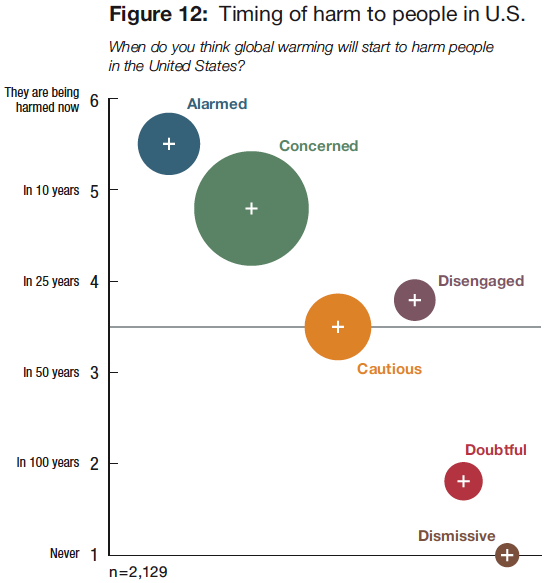
Six Americas Study, figure 12

Interesting that a majority also understand that it will be harmful to people in the US (i.e. not polar bears, not people in other countries), and pretty soon too, although there is a big difference in understanding the urgency across the different groups.

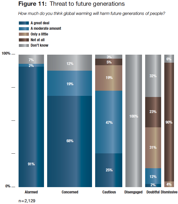
The next graph was interesting, partly because of the vast differences across the groups, but also, as Connie pointed out, because the disengaged group answered 100% “don’t know” and this never happens in social science research (which leads me to speculate that these clusters aren’t like normal social groupings with very fuzzy boundaries, but are more like religious groups, with explicitly affirmed belief sets):

Six Americas Figure 11

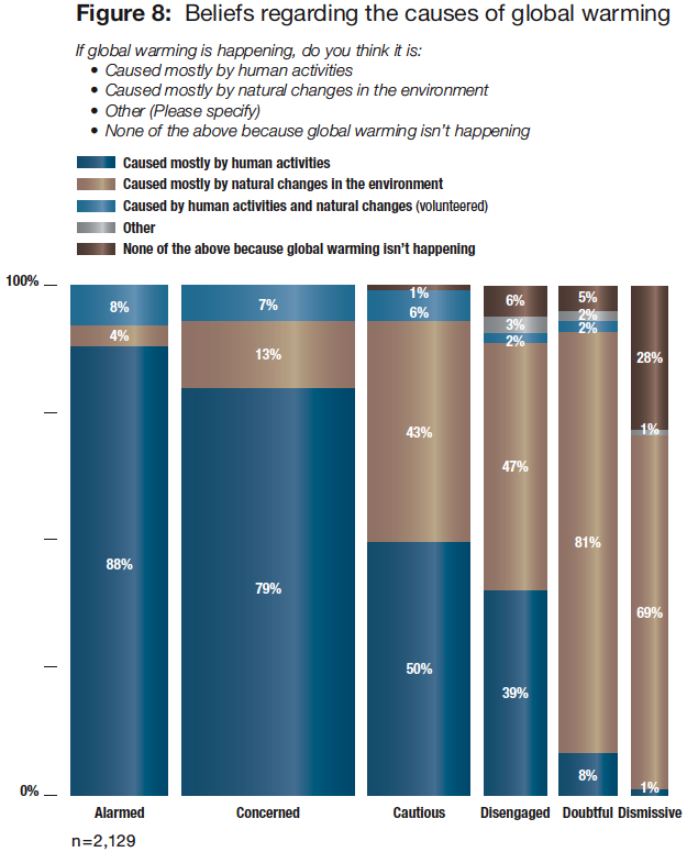
But of course, the scientific literacy question is about how well people understand the causes of climate change. The interesting thing about figure 8 is that many respondents wrote in an additional response mode (“caused by both human activities and natural changes”) which wasn’t in the questionnaire. If it had been, it’s likely that more people would have selected this response, and it’s arguably the most accurate scientifically, if you take a broad view of earth system processes:

Six Americas Figure 8

However, there’s a significant number of people in all groups who believe there is a lot of disagreement among scientists (they should come to the AGU meeting, and see if they can find any scientists who who think that human-induced global warming is not happening!):

Six Americas, Figure 9

But note that there is a widespread trust in scientists as a source of information (even the dismissives don’t go so far as to actively distrust scientists):

6 Americas, figure 35

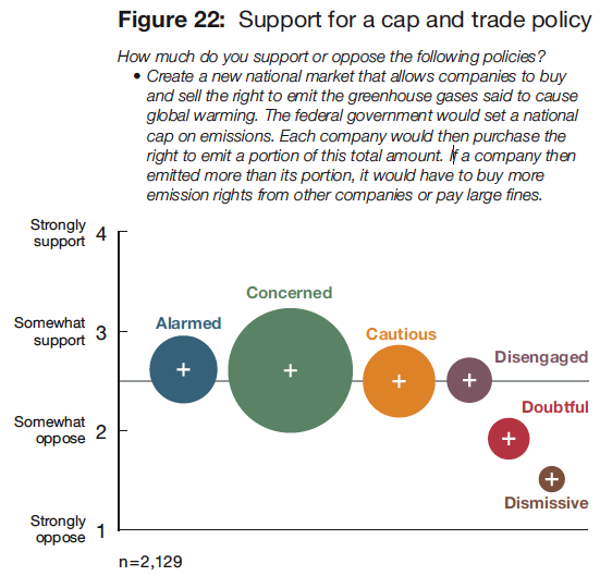
There was strong support for making global warming a priority for the US, but some interesting disagreement about suitable policy responses. For example, very mushy support for cap-and-trade:

Six Americas, figure 22

But very strong support for rebates on purchasing solar panels and fuel-efficient vehicles:

Six Americas, figure 21

As far as climate science literacy is concerned, the question is how to reach the groups other than the alarmed and concerned. These are the people who don’t visit science museums, and who don’t seek out opportunities to learn about the science.

The next talk, by Steven Newton of the National Centre for Science Education, was equally fascinating. NCSE is one of the leading organizations fighting the creationists in their attempts to displace the teaching of evolution in schools (and host of Project Steve, of which I’m Steve #859). Steven presented an analysis of how creationists reacted to the story of the CRU emails over the last few weeks. He’s been monitoring the discussion boards at the Discovery Institute, a group who support the idea of intelligent design, avoid making overt biblical references and prefer to portray themselves as a scientific group. First, since the story broke, there have been doubled the normal number of posts on their blog, with some very strong language: “toxic leftist-atheist ideology”. “a cabal”, “reaction of Darwinist and of global warming scientists to even the most mild skepticism is remarkably vicious”. “there will be an accounting”, “massive defunding of organized science”. This is interesting, because it is exactly what they say about evolution!

Steven argues that it’s clearly denialism. These people don’t think that science as a methodology works (in part, because it refused to acknowledge the role of a supernatural agency). They reject the methods of science (e.g. radiometric dating for evolution; computer modeling for global warming). They reject the data (e.g. observable evolution; observable climate data). They have very fixed mindsets (e.g. “no evidence will prove evolution”; “no evidence will prove global warming”). And they believe in a conspiracy (e.g. the “establishment” hiding the truth; stifling dissent).

This analysis leads to questions about how schools treat climate change, given this is now so contentious for evolution, and a concern that climate science education will become a battleground in the way that evolution did. Only 30 states have standards for teaching global warming in schools, and these are mostly focussed on impacts, not causes. Out of the 30 different statewide standards, only 7 mention fossil fuels, 8 mention mitigation, 17 mention mechanisms, and none mention sea level rise (and I’ll bet none mention ocean acidification either).

Some of these states have clauses that explicitly link topics such as evolution and global warming. For example, the Louisiana Science Education Act (LSEA) allows teachers to bring into the curriculum materials not generally approved, including “on topics of evolution, global warming, human cloning, …”. In Texas, the law mandates that textbooks must promote a free market approach (which would make discussion of cap-and-trade difficult), and textbooks must “Analyze and evaluate different views on the existence of global warming”. The wording here is crucial – it’s about views on the existence of global warming, not the details of the science.

Next up, Dennis Bartels, the executive director of the Exploratorium in San Francisco, talked about the role of science museums in improving climate literacy. He pointed out that it’s hard to explain to kids and adults about climate change – the topic is so complex. One problem is math literacy. Calculus is a capstone course in most high schools, but you need some basic calculus to understand the key concepts of emissions and concentrations of greenhouse gases, so it can’t be taught well in the high school curriculum. Also, kids aren’t ever exposed to thinking about systems. Adults are still invested in the myth that science is about truth, rather than understanding that science is a process. Hence, the public don’t get it, and are especially put off by the typical back and forth you get with the “received wisdom” approach (e.g. “Coffee is good for you”, then “coffee is bad for you”, and eventually “those damn scientists don’t know what they’re doing”).

Science centres that have tackled climate change have tended to fall into a proselytization mode, rather than teaching science as a process. The Exploratorium is exploring ways of overcoming this. For example, they’ve run workshops to bring the scientists who do polar expeditions together for a week, getting them to show and tell how they do their research, and then repackaging this for science centres across the country. The aim is to tell the story of how the science is done. Most of the best work in science centres isn’t the exhibits, it’s mediated sessions and live presentations. This contributes to getting people to think for themselves (rather than telling them what to think).

Another approach is to get people to think through how they know what they know. For example, ask people how they know that the earth is round. Did you directly observe it? Run and experiment to show it? Learn it in school? Get it from some authority? Then compare answers with others, and come to realise that most of what you know about the world you get from others (not through direct experience/experimentation). The role of trusted sources of scientific expertise is taken for granted for some areas of science, but not for others. You can then challenge people to think about why this is.

In the question session, somebody asked how do you reach out to people who don’t come to museums (e.g. the dismissive and disengaged)? Dennis’ answer pointed to the European cafe scientifique idea – after the soccer game, do an hour of science in a cafe.

Tom Bowman, a graphic designer, talked about how we translate scientific conclusions about risk for the public. His approach is to identify key misconceptions, and then re-adapt key graphic figures (eg from IPCC) to address them. Then, test these with difference audiences (he gave a long list of business conferences, public lectures, informal science institutions where he has done this).

Key misunderstandings seem to be (esp from Connie’s talk) about the immediacy of impacts (both in time and scale), the scale of the mitigation required, whether viable solutions exist, and whether we make effective choices. Hence, Tom suggested to start not by explaining the greenhouse effect, but by focussing on the point at which people make decisions about risk. For example, Limit + Odds = Emissions Trajectory (i.e. figure out what temperature change limit you’ve comfortable with, and what odds of meeting it you’d like, and design emissions trajectories accordingly). Then from there work out options and tradeoffs.

Take, for example, the table in the IPCC report on emissions scenarios – to a graphic designer, this is a disaster – if the footnotes are as big as the figure, you’ve failed. So what are the alternatives? Tom’s designed a graphic with a thermometer (with the earth as the bulb), on which he plots difference scenarios (I can’t find the graphic online, but this is similar). Points on the thermometer can then be used to show impacts at that level of global warming. This graphic has worked so well that everyone he has presented it to wants a copy (er, add me to the list, Tom).

However, sometimes things don’t work out. He also tried to map peak year emissions onto the thermometer. This doesn’t work so well, so instead he’s using the trillionth tonne analysis, and then the “ski slope” figure from the Copenhagen diagnosis:

Emissions pathways to give 67% chance of limiting global warming to 2ºC

Emissions pathways to give 67% chance of limiting global warming to 2ºC

Tom’s still working on the graphics for this and hopes to have full set by February, looking for ways to test them out.

Finally, talking about making climate science accessible, Diane Fisher presented NASA’s Climate Kids website, which is hosted by NASA’s webby award-winning Eyes on the Earth site. A key challenge is to get kids thinking about this subject right at the beginning of the educational process. In designing the site, they had some debate on whether to do the “most scientists agree” approach. In the end, they decided to take the “this is the way it is” approach, which certainly reduces the potential to confuse. But there’s a difficult balance between telling kids how things are, and scaring them to death. A key principle for ClimateKids was to make sure to give them positive things to do, even if it’s just simple stuff like reusable water bottles and riding your bike. More interestingly, the site also covers some ideas about career choices, for longer term action. I like this: get them to grow up to be scientists.

There has been a strong thread at the AGU meeting this week on how to do a better job of communicating the science. Picking up on the workshop I attended on Sunday, and another workshop and townhall meeting that I missed, came two conference sessions, the first, on Tuesday, on Providing Climate Policy Makers With a Strong Scientific Base, and the second on Wednesday, on Education and Communication for Climate Literacy and Energy Awareness.

I’ll get to the speakers at these sessions in a moment. But first, I need to point out the irony. While the crazier sections of the blogosphere are convinced that scientists are involved in some massive conspiracy with policymakers hanging on their every word, the picture from within the scientific community is very different. Speaker after speaker expressed serious concerns that their work is being ignored, and that policymakers just don’t get it. Yet at the same time, they seemed to have very little clue about the nature of this communication problem, nor how to fix it. In fact, a number of speakers came across as charmingly naive, urging the audience to put a bit more effort into explanation and outreach. The notion that these completely guileless scientists could be conspiring to hide the truth is truly ludicrous.

So why so many speakers and sessions focussing on science communication? Why the sense of failure? Well, on the one hand there was the steady stream of news about a lack of progress in Copenhagen, building on a year of little progress in the US Congress. On the other hand is the widespread sense in the AGU community that the IPCC AR4 is out of date, with the new science of the last 4-5 years dramatically removing some of the remaining uncertainties (see Alley’s talk for one example), and, in nearly every case, confirming that the AR4 projections understate the magnitude of the expected warming and its impacts. Perhaps the best summary of this is the Copenhagen Diagnosis, which documents how…

…several important aspects of climate change are already occurring at the high end, or even beyond, the expectations of just a few years ago. […] global ice sheets are melting at an increased rate; Arctic sea ice is thinning and melting much faster than recently projected, and future sea-level rise is now expected to be much higher than previously forecast.

As an aside, the European EGU meeting in April lacked this strong sense of communication failure. Could this be a mark of the peculiarly American (oh, and Canadian) culture of anti-science?  of lack of science literacy? Or perhaps a sense that the US and Canada are lagging far behind on developing science-based policy?

Anyway, on with the sessions. For the session on “Providing Climate Policy Makers With a Strong Scientific Base”, the first speaker was David Carlson, director of the International Polar Year (IPY) programme office. He argued that scientists are definitely not having the influence on policy that they should and the weakness of any likely agreement in Copenhagen will prove this. He described a number of examples of science communication in policymaking, analyzing whether the transmitters (scientists) and/or the receivers (policymakers) did a good job.

The first example was on ocean fertilization. The Solas study demonstrated that ocean fertilization will be ineffective. This message was received by the IMO convention on marine pollution, which issued a policy statement noting with concern the potential for negative impacts from ocean fertilization. There was one small problem – the policy was widely interpreted to mean all ocean fertilization is bad, which then prevented small scale experiments as part of IPY. So, the transmitter was good, receiver even better, but this led to unintended consequences.

Another example was a US senate heraring that David appeared at earlier this year, for the Kerry-Boxer bill. The hearing focused on the arctic, and included three senators, several senior scientists, lobbyists, a consultant, and a representative from an NGO. (note: David wasn’t complimentary about the roles of the non-scientists: the lobbyists were there to promote appropriations, the consultant was there to promote his previous work, and the NGO rep claimed “the dog ate my homework”). As the chair didn’t hear a clear message from the participants, the hearing was held open, and they were invited submit a joint report in 48 hours. David circulated a draft summary within 8 hours to others, but got no response. In the end, it appears each participant submitted their own text. The Kerry-Boxer bill was introduced in the senate a few weeks later, containing no language at all about the impacts on the arctic. His conclusion is that a failure to work together represented a substantial lost opportunity. And this theme (of acting as individuals, and failing to coordinate, cropped up again and again in the talks).

The next speaker was Ed Struzik, science journalist and author. Ed characterized himself as the entertainer for the session, and laid on a beautiful series of photographs to illustrate his point that climate change is already having a dramatic impact on the acrtic, but it’s a very complicated story. For example, even just defining what constitutes the arctic is difficult (North of arctic circle? Area where warmest summer month averages 9ºC?). It’s a very varied geography (glaciers, tundra, forest, smoking hills, hot springs, river deltas, lakes, etc). It’s a sacred place “where god began” for native peoples. And lots of fresh clean water: big rivers. Arctic wildlife. And while many of the impacts of climate change are frighteningly negative, not all are: For example the barren ground grizzlies will do well – warming will mean they don’t need to hibernate as long. And more ominously, a warming arctic creates opportunities to exploit new fossil fuel reserves, so there are serious economic interests at stake.

James Mueller from the office of US senator Maria Cantwell gave an insider’s view of how the US senate works (and a little plug for Cantwell’s CLEAR Act). Unlike most speakers in the session, he argued that scientists have done a good job with science communication, and even claimed that behind closed doors, most senators would agree climate change is a big problem; the challenge is reaching agreement on what to do about it. He suggested scientists need a more realistic view of the policy process – it takes years to get major policy changes through (cf universal healthcare), and he takes it as a good sign that the House vote passed. He also argued that less than twenty years from the first IPCC report, the science is well-developed and accepted by the majority of non-scientists. In contrast, energy economists have a much wider disagreements, and are envious of the consensus among climate scientists.

James then described some difficulties: the drive towards specialization in the science community has led to isolation among climate scientists and policy experts. There’s a lack of math and science literacy among staff of the politicians. And, most importantly, the use of experts with “privileged information” runs counter to democracy, in that it’s difficult to maintain accountability in technocratic institutions, but difficult to get away from the need for specialist expertise.

However, I couldn’t help feeling that he missed the point, and was just giving us political spin to excuse inaction. If the vast majority of senators truly understood the science, there would have had no problem getting a strong bill through the senate this year. The problem is that they have a vague sense there is a problem, but no deep understanding of what the science really tells us.

Amanda Staudt from the National Wildlife Foundation dissected the way in which IPCC recommendations got translated into the details of the Waxman-Markey bill and the Kerry-Boxer bill (drawing on the analysis of the World Resources Institute):
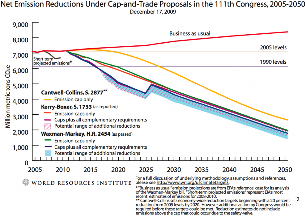
WRI analysis of the various bills of the 111th Congress

WRI analysis of the various bills of the 111th Congress

The process looks like this:

(1) Politicians converged on 2°C temperature rise as an upper limit considered “safe”. The IPCC had a huge influence on this, but (as I noted above) recent advances in the science were not included.

(2) Then policy community needed to figure out what level of greenhouse gas emissions would achieve this. They looked at table 5.1 in the IPCC Synthesis report:

IPCC AR4 Synthesis report table 5.1

…and concentrated on the first row. The fact that they focussed on the first row is a remarkable achievement of the science, but note that these were never intended to be interpreted as policy options; the table was just a summary of six different scenarios that had been considered in the literature. What was really needed (and wasn’t available when the IPCC report was put together) is a more detailed analysis of even more aggressive emissions scenarios; for example, the study that Meinhausen did earlier this year that gave a 50:50 chance of staying within 2°C for 450ppm stabilization.

(3) Then they have to determine country-by-country emissions reductions, which is what the “Bali box” summarizes.

(4) Then, what will the US do? Much of this depends on the US Climate Action Partnership (USCAP) lobbying group. The USCAP blueprint recommended an 80% reduction by 2050 (but compromised on a 1.3% reduction by 2020 – i.e. a slower start to the reductions.

The key point is that there was little role for the scientists in the later steps. Congress gets exposed to the science through a number of limited mechanisms: Hearings; 2 page summaries; briefings sponsored by interested parties (The CEI runs a lot of these!); lobby visits (there were a record number of these this year, with energy companies vastly outspending green groups); fact sheets; and local news stories in politicians’s own districts.

Amanda’s key point was that scientists need to be more involved throughout the process, and they can do this by talking more to their congresspersons, working with NGOs who are already doing the communications, and to get working on analyzing the emissions targets ready for the next stage of refinements to them. (Which is all well and good, but I don’t believe for one minute that volunteerism by individual scientists will make the slightest bit of difference here).

Chris Elfring of the National Academics Board on Atmospheric Sciences and Climate (BASC) spoke next, and gave a summary of the role of the National Academy of Sciences, including a history of the Academies, and the use of the NRC as it’s operational arm. The most interesting part of the talk was the report America’s Climate Choices, which is being put together now, with four panel reports due in early 2010, and a final report due in summer 2010.

All of the above speakers gave interesting insights into how science gets translated into policy. But none really convinced me that they had constructive suggestions for improving things. In fact the highlight of the session for me was a talk that didn’t seem to fit at all! Jesse Anttila-Hughes, a PhD student at Columbia, presented a study he’s doing on whether people act on what they believe about climate change. To assess this, he studied how specific media stories affects energy company stock prices.

He looked at three specific event types: Annoucements of record a temperature in the previous year according to NASA’s GISS data (6 such events in the last 15 years); Annoucements of sea-ice minima in the Arctic (3 such events); and annoucements of Ice shelf collapses in the Antarctic (6 such events). He then studied how these events affect the stock prices of S&P500 energy companies, which together have about a $1.2 trillion market capitalization, with 6.5 million trades per day. I.e. pretty valuable and busy stocks. The methodology, a version of CAPM, is a bit complicated, because you have to pick a suitable window (e.g. 10 days) to measure the effect, and allow a few days before the story hits the media, to allow for early leaks. And you have to compare how the company is doing compared to markets in general each day.

Anyway, the results are fascinating. Each announcement of a record hot year causes energy stocks across the board drop by 3% (which, given the size of their market capitalization, is a huge loss of value). However, when ice shelves collapse you get the opposite response – a 2.5% rise in energy stocks. And there is no significant reaction to reports about sea ice minima (despite a number of scientists regarding this as a crucial early warning signal).

The interpretation seems pretty straightforward. Record temperatures are the purest signal of climate change, and hence cause investors to pay attention. Clearly, investors are taking the risk seriously, anticipating significant regulation of fossil-fuel energy sources, and have been doing so for a long time (at least back into the mid-90s). On the other hand, collapsing ice sheets are seen as an opportunity, in that they might open up more areas for oil and gas exploration, and it seems that investors expect this to outweigh (or precede) any climate change legislation. And sea ice minima, they probably don’t understand, or end up as a mixed signal with exploration opportunities and regulation threats balancing out.

More detailed followup studies of other such news stories would be fascinating. And that’s really got me really thinking about how to effect behaviour changes…