I was doing some research on Canada’s climate targets recently, and came across this chart, presented as part of Canada’s Intended Nationally Determined Contribution (INDC) under the Paris Agreement:
Looks good right? Certainly it conveys a message that Canada’s well on track, and that the target for 2030 is ambitious (compared to a business as usual pathway). Climate change solved, eh?
But the chart is an epic example of misdirection. Here’s another chart that pulls the same trick, this time from the Government’s Climate Change website, and apparently designed to make the 2030 target look bravely ambitious:
So I downloaded the data and produced my own chart, with a little more perspective added. I wanted to address several ways in which the above charts represent propaganda, rather than evidence:
- By cutting off the Y axis at 500 Mt, the chart hides the real long-term evidence-based goal for climate policy: zero emissions;
- Canada has consistently failed to meet any of it’s climate targets in the past, while the chart seems to imply we’re doing rather well;
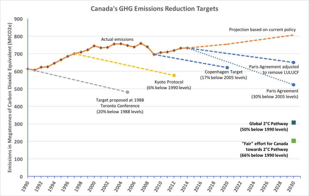
- The chart conflates two different measures. The curves showing actual emissions exclude net removal from forestry (officially known as Land Use, Land Use Change, and Forestry LULUCF), while Canada fully intends to include this in its accounting for achieving the 2030 target. So if you plot the target on the same chart with emissions, honesty dictates you should adjust the target accordingly.
Here’s my “full perspective” chart. Note that the first target shown here in grey was once Liberal party policy in the early 1990s; the remainder were official federal government targets. Each is linked to the year they were first proposed. The “fair effort” for Canada comes from ClimateActionTracker’s analysis:
The correct long term target for carbon emissions is, of course zero. Every tonne of CO2 emitted makes the problem worse, and there’s no magic fairy that removes these greenhouse gases from the atmosphere once we’ve emitted them. So until we get to zero emissions, we’re making the problem worse, and the planet keeps warming. Worse still, the only plausible pathways to keep us below the UN’s upper limit of 2°C of warming requires us to do even better than this: we have to go carbon negative before the end of the century.
Misleading charts from the government of Canada won’t help us get on the right track.


Would be interesting to plot the proposal from Stephane Dion’s Green Shift platform, had it been enacted.